
Author Archive
Is Manga Art?
November 9th, 2010 Posted 4:33 AM


When I was younger I used to have a huge obsession with manga and anime. The story usually went like this: I watch an anime that I particularly love; I head to the bookstore and buy the entire series; I become broke. Or like this: I read awesome reviews on a new series that just came out; I head to the bookstore and buy the entire series; I become broke. Actually these are only some of the remnants of my manga craze; I don’t own all of what I used to own because the majority of them I either sold on eBay or gave to friends. I think part of my huge love for anime partly came from the interest in the Japanese language. I was just getting into learning Japanese, and it was so fun and encouraging at the same time when I could even vaguely understand what was going on in the story. Fortunately now I’ve grown out of that joy and decided to spend my money on better things, but I am ready to take the adolescent obsession to the next level. Recently I have been encouraged to perceive art in a not as restrictive way as it could come across as, and that eventually leads to my ultimate question; WHAT IS MANGA? IS IT ART? AND WHY AM I SO INTERESTED IN IT??
In the most basic sense, manga are printed comics written in Japanese style – certain common story lines, specific drawing styles, text reading from right to left, etc. It is safe to say that manga is a very firm medium connecting the Japanese population of all ages, made possible by the variety in the genre and theme of manga – everything from action-adventure, romance, and comedy to horror, sexuality, and science fiction.
To the non-comprehender of manga, it might seem childlike and unrealistic, which is true – not all mangas bring the greatest fun or contain the deepest ideas, my own mother had a hard time trying to rationalize my obsessive behavior, and she would sometimes blandly put it in her most extreme way – as “useless picture books.” Of course I tried arguing with her about it, and my opinion on this matter still stays safe and firm; by no means does manga deserve to be underestimated as some children’s picture books. Wikipedia defines art as “the product or process of deliberately arranging symbolic elements in a way that influences and affects the senses, emotions, and/or intellect.” People including myself smile, frown, laugh, and cry over manga. It works as though it has some magical sense in altering people’s emotions; it allows you to first get just a taste of the world presented in the series you are reading, and then slowly pulls you deeply into the character’s emotions so that you end up either truly loving or hating them.
Then the non-comprehender might argue, is it safe to say that all things that bring changes to our emotions can be considered art? I am not the one to assert a strong yes or no to this question, but one thing I am certain of is that manga, just like much of the art we see in museums or galleries, contain deeper meanings than what is seen on the surface level. For example, I just did an assignment related to the relationship between the nature and the industry depicted in Chris Doyle’s work “Waste_Generation,” which reminded me of an anime/manga that I watched/read a few years ago, called “Wolf’s Rain.” The underlying theme of this anime was much like that of Doyle’s piece – the silent battle between the wolves(nature) and the humans(manipulators), both sides striving to discover Paradise, which is thought to bring an end of the dirty, corrupt, current world and bring about an idyllic society, where both the wolves and humans would live together in harmony.
Manga also allows you to imagine freely. You are by no means restricted to only what is happening on paper. One reason I generally preferred reading manga to watching anime was that I liked to imagine voices on my own, color the scenes in my own way, and bring life to each still motion the way I would like to see it. You have plenty of room to make your manga series “your own” rather than have somebody paint the whole thing for you.
Art and manga have much in common. In fact, manga is art. It features all the qualities one might look for in a more formal or traditional or even more “artistic” artworks (in their opinion). At this point I can safely conclude that my teen allowances weren’t vainly spent. They were spent for a healthy cause and greatly enhanced my emotional development and stability. And they are also making me consider reopening Pandora’s Box!
Posted in Others
Fred Tomaselli and Sol LeWitt
November 9th, 2010 Posted 2:21 AM
FRED TOMASELLI
Fred Tomaselli, born in Santa Monica in 1956, is an American artist best known for his wood paintings, and his use of unusual objects such as marijuana leaves, psychoactive drugs, and resin. He sees his artworks as a medium to a surreal, otherworldly universe.
We as a class observed one of his works in the James Cohan Gallery in Chelsea. It was a mixture of many different seemingly unrelated objects which were used to imply a sense of collision between the artifcial and natural sources.

Fred Tomaselli "Glassy"
SOL LEWITT
Sol Lewitt was an American artist related to works containing various movements, including conceptual art and minimalism. Minimalism is connected to the concept conveyed in Mary Temple’s work “Among Friends and Enemies.” He exhibited in countless museums and galleries since 1965.
LeWitt was prolific in a diverse array of subjects, but he was most famous for his wall drawings and his structures. His works are characterized by geometrical figures, structural drawings, and mechanical sculptures, varying much in size.
Lewitt influenced many artists of his time. His art has a deeper meaning than the surface appearance; it conveys the idea behind the work itself, and changes the relationship between the idea and the art that it produces.

Sol LeWitt "Four-Sided Pyramid"
Posted in Assignments
The Chelsea Galleries Experience
November 9th, 2010 Posted 1:55 AM
Daniel Canogar’s “Trace”
In both of Canogar’s works, he tries to encompass the ephemeral qualities of the moments in our lives by using technology that brings quick, fleeting images onto his works. He uses materials he gathered from dumpsters, often collecting objects uncaringly discarded or put up for flea market sales. He rediscovers life in these forgotten objects by creating motion works directly onto them. In Dial M For Murder, he uses VHS tapes and specifically programmed video projection to create a reflective visual illusion that almost invokes the image of a living organism. In “Spin,” he projects short video clips right onto the thrown-out DVDs he has collected, which have been displayed in disarray. When the video clips are projected against the wall on the opposite side, however, they are slightly deformed, some being larger and clearer, others being smaller, twisted, and harder to perceive. These projections even seem to resemble the human eyes, each one perceiving a different image at a different time.
Daniel Canogar \”Trace\” at Bitforms Gallery
Chris Doyle’s “Waste_Generation”
Doyle’s work Waste Generation reflects on the incessant cycle between the nature and industrialism. His work is in the form of animation, thus giving a particular emphasis on the evolving nature felt throughout. Some of his images include intertwined vines, city-like landscape drawn on a patterned background, and many four-sided symmetries, constantly transforms into yet something else. Doyle’s idea coincides with that of Canogar’s, in that they both show resentment towards the wasteful, destructive quality of modern society. Moreover, Doyle especially focuses on symmetry; he resents the way the world seems to seek beauty in only symmetry and rationality, as opposed to the free-growing quality of the nature.

Chris Doyle "Waste_Generation"
Abelardo Morell’s “The Universe Next Door”
Morell’s photographic works combines a very formal, enclosed setting with the free, unrestrained view of the outside landscape reflected off the window. He manages to capture the two contrasting images into a single view through the use of the camera obscura, placed in front of the room’s aperture hole. The beauty of his works is in the ambiguous aura of time and space. He obscures the sense of the passage of time in order to emphasize the ambiguity. Moreover, his photographs present such a distinct contrast between what is directly placed in front of us and what is reflected on the wall, to the point where it almost seems ironical. This irony, seen from another perspective, also exists between the things that occupy most of our lives and the things that are often neglected; we barely get a chance to appreciate the nature or the surroundings.

Abelardo Morell "The Universe Next Door"
Mary Temple’s “Among Friends and Enemies”
Temple brings every day world events into her own work Among Friends and Enemies. Each day, Temple draws a portrait of a world figure that has made an impact on the world, either positively or negatively, accompanied by a short caption at the bottom. Her work now accumulates to a large scale calendar-like display of portraits of world figures, each day exhibiting its own figure. This appearance resembles a musical notation where the notes come together to create a smooth flow of wave with its highs and lows. The fact that she manages to embody her own view on these world events make her work even more unique. Her work also encompasses the idea of changing times and the evanescence of our world, where new events and changes never seem to come to a halt. Another of Temple’s work in the gallery is the printed images of Obama on $5 bills, which is significant in that Temple is interpreting her own perspective on Obama in an interesting, diverse way by drawing Obama so that he seems to be communicating with Lincoln.

Mary Temple "Among Friends and Enemies"
Roxy Paine’s Distillation
Roxy Paine’s work is abstract and ironical. Distillation is a process to find purity, yet his definition of distillation, seen throughout the entire range of space, seems to contradict the denotation; his installation gives off a feeling of strong industrialism. The shape of Paine’s structure clearly indicates that of the human organs, but curiously enough, it is created with manmade and artificial materials such as steel and paint. The basic idea behind her work is again the clash between the materialistic human society and the nature. We also saw a wall installation, which was quite a peculiar mixture of both the natural and unnatural. In this work, he depicts especially the types of fungus that are toxic, embedded together with psychoactive pills. This illustrates the uncomfortable fight between the two forces, one artificial and the other natural.

Roxy Paine "Distillation"
In all of the works that we viewed, what seemed to be the most prevalent idea was the collision between the nature and society, the real and the fake, the natural and the unnatural. What I perceived as interesting was that none of the artists exactly pinpoint a side to be superior to the other; they merely present the irony between the two existing forces and leave it as it is, without specifying the authority of one over another.
Posted in Assignments
The Metropolitan Museum Experience
November 3rd, 2010 Posted 1:47 AM
How did the Starn twins (Big Bambu), Katrin Sigurdardottir (Boiseries) and the contemporary photographers (Beyond Here and There show) change our perspective –on the city, on the museum, on definitions of art? What strategies did they use to alter our perception of time and/or space? What did we–the spectators–see anew as a result? Give at least one example from each artist/show.
Big Bambu, created by Mike and Doug Starn, supposedly fully taken down on October 31, was no doubt a magnificent monument that I not only enjoyed viewing and walking within, but its theme and the artists’ intentions behind it also significantly changed my perspective on both the specific art piece and on the city itself. Its forest-like appearance tricks the viewer of time and space, giving it an almost surreal, dreamlike effect, which is rather a rare encounter especially in the heart of New York City. The structure goes through a sort of an ever-involving process; viewers get a chance to actually observe the constructors and rock climbers building the structure and taking it down, a process that almost makes the construction seem alive. This relates to the fact that it is located at the Metropolitan Museum of Art, New York City, both of which are places that never seem to stop changing, or “evolving.”

Big Bambu created by the Starns
Katrin Sigurdardottir’s two constructions came to me as sort of a surprise because I would never have expected such fairylike, otherworldly artworks at a museum that suggested a sense of seriousness and royalty from its entrance. One of her two structures is the standalone white room, which was so white almost to the point of numbness. The room and the furniture are miniscule, which otherwise the viewer would have felt more like a guest invited into a room, rather than an outside viewer looking into the room as a whole. This structure, as opposed to the actual period room which it was modeled from, exists almost as an object in a museum, rather than a place or an area located in a corner where you can go and visit. The artist used one-sided mirrors that seem to give the piece a more enclosed feeling and act as a barrier between reality and fantasy. Her other piece was actually modeled from Hotel de Cabris which we had seen earlier in the day. Each panel of the walls is lined up in a zigzag pattern, instead of firmly lined against a wall. The artist altered the scale of the panels so that they get progressively smaller by the piece. This again creates an almost comical, surreal mood, enabling us to “look” at the work more as an object rather than appreciate it as a place. We almost seemed to forget that the folding screen like structure was actually the replica of an enclosed chamber that we had observed before.

The photography exhibit Between Here and There was also indicative of the sense of ambiguity of time and space. A chaotic and disorganized mood especially in the idea of setting and existence seemed to be what the artworks had in common in this exhibition. One artwork that particularly lingers in my mind is the one with many postcards, called I Got Up, by On Kawara. All postcards were of New York City views, but surprisingly they were sent from many different locations. One very noticeable feature is the great lack of pattern in the time the artist “got up” every day, which makes it impossible to set a steady pattern in any way; we are plunged into a total chaos of time and existence.

"I Got Up" by On Kawara
Posted in Assignments
Les Contes D’Hoffmann – From The Musical Aspect
November 3rd, 2010 Posted 1:38 AM
Research biographical information on the composer, Jacques Offenbach, and the creation of this opera. What was his musical style; did it change over time?
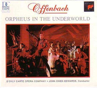
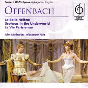
Jacques Offenbach was a German-born French composer, a cellist, and one of the pioneers of the operetta form. The Tales of Hoffman was his only grand opera, with a more serious and ambitious tone to it, as opposed to most of his other works, which are operettas, or “light operas.” He composed many operettas, which gained popularity in the English speaking countries during the mid 1800’s. His operettas, such as Orpheus in the Underworld and La belle Hélène, were characterized by wittiness and political satire, as well as parodies of grand operas. Having gained excessive popularity with his operettas, he hoped to become a master of serious opera as well. He was thus determined to compose a grand opera, which he called Les Contes d’Hoffmann, or The Tales of Hoffman. Unfortunately, however, he didn’t live long enough to see it gain immediate popularity and eventually rise as one of the most renowned operas. Offenbach’s later works are mostly patriotic in nature, expressing his loyalty and allegiance towards his adopted country, France.

Jacques Offenbach (1819-1880)
What was his importance as a composer or musician? What is his legacy and what were his particular accomplishments?
Offenbach was one of the most important pioneers of the operetta form. Operettas are commonly known as light operas, in which oftentimes the libretto is spoken rather than sung. They are generally shorter in length than most conventional grand operas, and lighthearted in nature. Offenbach’s operettas in particular, were mostly satirical works, which poked fun at the political and social picture in Paris. His works show delicately developed characterization and an extensive use of mythological subjects. Some of his operettas such as Orpheus in the Underworld and La belle Hélène gained extreme popularity during the mid 1800’s. As a young man, he was a successful cellist as well, often performing with some of the most prominent pianists, such as Mendelssohn, Liszt, and Rubinstein.
What are the precedents for the music in this particular opera? What is the structure and style of this opera, its famous arias and other musical sections or “numbers”?
The opera, composed of three acts, along with prologue and epilogue, boasts many famous arias. Much of Offenbach’s music in the Tales of Hoffmann is fast paced and lightweight, and almost has a comical sense. Especially Olympia’s aria Les oiseaux dans la charmille, or better known as “The Doll Song,” has an extremely high pitched, fun, and tuneful melody that emits almost a chirping-like quality. Some of the other arias of the opera are somewhat of a romantic and melancholic quality; for example, in Act 3, Antonia sings a sorrowful melody about love.

Opera singer Katherine Kim singing the Doll Song
What the musical source for the famous “barcarolle”? Where does it come in the opera and why?
Barcarolle was originally a melody sung by Venetian gondoliers. It is a term used for boat songs. Offenbach did not originally write the barcarolle for the Tales of Hoffmann; he began composing it as the “Elves Song” for another of his opera, but when he died without finishing Les Contes D’Hoffmann, his friend premiered the song along with the opera. In the performance that we watched, the song comes in during the third act in a rather erotic scene where the flow is at its most climactic point.

Barcarolle was originally sung as a boat song
What are some adjectives that could be used to describe his musical style?
Some adjectives that could be used to describe Offenbach’s musical style would be light-hearted, upbeat, tuneful, romantic, diverse, solemn, dramatic, and grotesque.
Talk about musical instruments used as well as the use of the voice.
A diverse range of musical instruments was heard. There seemed to be an even balance between the strings and woodwind instruments. The orchestral background music flew in perfect harmony with the voices, with the instrumental music supporting the voices just enough to add to the eclectic feelings the voice conveys.
Why do you think Offenbach was drawn to the Hoffmann stories? Where did he become familiar with them?
I think Offenbach was drawn to Hoffmann’s short stories because of their romantic quality as well as their vague connection to psychological works of man. All three of the Hoffmann stories employed in the opera generate somewhat of a manic quality, in spite of the cheerfulness of some parts.
What was his relationship to the librettists? How did they work together?
He maintained a close relationship with the librettists. They formed a team and worked together to create pieces that had both intense musical ideas and drama aspects. It is quoted that he considered them almost as his own sons.
How does the feeling evoked in the Hoffmann stories change through the music?
The music in the opera is a fairly good indicator of the mood of a particular scene. It succeeds in generating new feelings, other than those already evoked by the acts. In Act 1, or “the Olympia act,” the general mood of the entire segment was relatively fun, and Olympia’s aria is relevantly upbeat and high-pitched. On the other hand, the second act was characterized by a more serious and melancholic atmosphere, although there was a fun piece sung by the servant in the beginning. Accordingly, the aria evoked a rather somber and gloomy feeling.
Posted in Assignments
Fall For Dance
November 3rd, 2010 Posted 1:09 AM
“I Can See Myself in Your Pupil” – This title seems to reflect the dance pretty directly. According to a review by Margaret Fuhrer, the dancers are supposed to pick out a person from the audience and stare right down at them throughout the entire performance.
Credits: Choreographer – Andrea Miller
Music – “Adir Adirim” and “Cha Cha” by Balkan Beat Box.
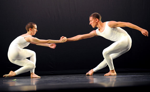
Choreography: The dance was very lively and upbeat. The trio where there were three female dancers followed a certain pattern, and returned to the beginning a couple times during the performance. The movements were active and full-bodied, and the trio dancers synchronized only at certain times; at other times there seemed to be one dancer who performed independently, but soon enough joined the other two. The duet seemed much like a conversation between the two dancers, a male and a female. They seemed to portray a couple in love, but surprisingly the choreography wasn’t overly romantic or sentimental; it was impersonated in a rather fun way. The dancers took turns with each other on certain movements.
Set/stage and lighting design: The lighting seemed to remain rather dim throughout the performance. I found it ironical as the dance itself is so lively and full of action. The lighting could have a little more role than it did, but it may be the choreographer’s intention in order to emphasize the dance even more.
Costume design: The female dancers were wearing very colorful dresses – bright pink, gray/pink, and green. The male dancers were dressed in the same outfit – a simple white dress shirt and black pants.
Sound/music – The music was played by an Israeli band called Balkan Beat Box. The instruments used in the music sounded somewhat Indian, though I can’t be sure. Both songs used in the performance were very upbeat and fast-moving, which seemed to coordinate with the dance well. Music was not played live.

“XOVER” – The title, pronounced “crossover,” suits the dance well because the performance didn’t look and sound anything like what I would expect from a conventional dance performance. It looked like the choreographer was trying to experiment with many different types of dances by combining them together.
Credits: Choreographer – Merce Cunningham
Set designer – Josh Johnson (lighting), Robert Rauschenberg, Plank.
Music Composer – John Cage “Aria” and Fontana Mix (1958)”
Choreography – The choreography, along with the music, seemed far from the standard. There seemed to be a pair of dancers performing in conjunction – a male and female – often dancing across the stage. There were sometimes two or three pairs at the same time. Their movements were rather rough, but most of the dance was slow-set. Also, the dance and the music didn’t synchronize, which made it surprising that the dancers were on perfect timing when the “music” they were dancing to didn’t go with the beat of their movements. The performance gave off a feeling of being mechanical and technological.
Set/Stage and lighting design – The background art, Plank by Robert Rauschenberg, seemed to represent industrialization, which flew well with the dance and music accompanied with it. Lighting, by Josh Johnson, seemed to have its focus mostly on the dancers, but it wasn’t bright at all. It was kept pretty dim.
Costume design – simple, white outfits that covered the dancers’ upper body and legs.
Sound/music – Music by John Cage. The music, again, sounded somewhat mechanical. It was part recorded, with the vocal part performed live. It was a song without a set rhythm, melody, or lyrics, but it seemed to correspond to the feelings that the dance conveyed.
“Vistaar” – This dance is an example of the odissi idiom, which is a traditional classical Indian dance. It is said to be inspired by literature and art from Hinduism.
Credits – Choreographer: Madhavi Mudgal
Music: performed live by musicians on stage.
Choreography – Much of the dance was very soft and graceful, but rhythmical at the same time. There were 5 dancers in total, all female, who moved about on stage together. Only rarely were they separated; for the most part they performed as a group. Their movements were powerful but soft, energetic but elegant. Their feet movements appeared to be the main focus of the dance. Their arm movements conveyed elegance and were also emphasized greatly.
Set/stage and lighting design – Instrumentalists were located on one part of the stage. They were sitting on an elevated floor. The five dancers crossed the stage during the dance, usually as a group. The lighting was focused on the dancers. As they moved, the lights followed them as well.
Sound/music – Music, again, was played live by the performers on the stage. There were five instrumentalists in total. They played a traditional Indian piece, which suited the odissi type of dance very well. The music, just like the dance, was very soft but had its strong moments. Vocalists: Sawani Mudgal, Madhup Mudgal Percussions: Itendra Kumar Swain Flute: Srinibas Satapathy Sitar: Yar Mohd
Costume design – Traditional Indian clothing for all dancers and performers; each dancer was dressed in a different color.

“The Golden Section” – I assume the dance is named The Golden Section for its brilliance and liveliness. The dancers were dressed in gold, which adds to the meaning of the title.
Credits: choreographer – Twyla Tharp
Music composer – David Byrne
Choreography – The dance was full of action, with a lot of jumping movements. There were 13 dancers in total, a mixed group of both male and female, and the whole group was on stage only on certain times. Just like their outfits, their dances were very full-bodied and daring, with great speed and rhythm. It was very energetic.
Set/stage and lighting design – The lighting was an especially important part of the piece. There was a golden light illuminating them on stage, making their golden outfits glare even more.
Sound/music – Music used for the performance was a piece by David Byrne. The song started out with a very upbeat series of beats and chords, which added to the anticipation of the dance that was about to come. The song was in exact synchronization with the dance movements, unlike the Merce Cunningham piece where it was hard to follow the music and the dance simultaneously.

Posted in Assignments
Restaurant Art
October 31st, 2010 Posted 2:48 AM

I work at a fusion Korean Chinese restaurant on 32nd Street, and this is a painting hanging on one of the walls. The painting is quite interesting; the women is definitely crying but something about her image doesn’t really convey sadness. Maybe it’s because her mouth seems to be smiling and her eyebrows aren’t arched downward which would normally indicate a sense of sorrow and uneasiness. The color contrast is also seen here with the red and yellow of the painting and the red and yellow of the walls.

This is part of the Asian-oriented decor of the place, which I think is kind of cute. This along with some of the other parts of the place entails the bright colors usually seen in Asian decorations, beautifully matched with some European features such as the chandelier and vanity mirrors (which I didn’t get to take a picture of)
Posted in Arts in NYC
Battery Park Sky
October 31st, 2010 Posted 2:42 AM
")
I was hanging out in Battery Park with a friend the other day, when I noticed this beautiful skyscape. I liked the fact that the sky looks part gloomy/dark and part bright/happy, with just enough amounts of the two. The running human was not intended at the moment I took it, so I immediately took another one when he was gone from view, but now that I’m looking at both pictures I like t more with the figure there. I think it adds a sense of motion into the picture.
Posted in Arts in NYC, Others
Snapshot Day 2010!
October 31st, 2010 Posted 2:35 AM

On Snapshot Day, October 11, all of us were to take pictures of our neighborhood, however we might define that. I was back home in Queens that day, and I wandered out at 9am, trying to see if I could take any tasty shots. However, my whole two-hour trip, to my dismay, came out to be useless. Disappointed, I decided to forget about it until later in the day. Then came the late hours of afternoon, and I finally decided to do something about the assignment. I usually like taking pictures of my dog, so I thought maybe I could somehow integrate the dog and the neighborhood in a single picture. So this is my dog Kiwi sitting on the windowsill, looking out the window, savoring the landscape, and not staring at my desperately attention seeking fingers right out of the camera frame.
Posted in Arts in NYC, Assignments
The Jewish Museum Experience
October 31st, 2010 Posted 12:42 AM
Artist’s Technique
William Kentridge’s four films – Johannesburg, great 2nd city after Paris, Mine, Monument, and Sobriety, Obesity, & Getting Old are all very gloomy and desolate. He achieves this kind of appearance by using charcoal to give a smudged look. According to the written explanation, he films every scene individually after erasing previous images and redrawing it, which is a technique called rotoscoping. He films the transformations one by one; this is why in some scenes you can see some traces or remnants of past images.
His choice of color palette is mostly grayscale, with limited use of other brighter colors. I noticed that he uses colors mostly for the background or large empty areas, or for certain things that he wishes to emphasize such as a ringing phone, or the sound coming off the speakers on the streets. Nevertheless, the general color scheme in his films is black and white, which contributes to the moodiness of the films.
Kentridge portrays certain things in a way that they’re used to symbolize something else while giving off a more magical, haunted sensation. He makes random objects morph into unexpected things that symbolize something significant. For example, a cat turns into a melting pot, while a bed turns into a pipe that drills down into the miners and their workplace.

Some of Kentridge's other drawings done with charcoal
Narratives of the Films
The main characters, Soho Eckstein and Felix Teitelbaum, are portrayed in a strikingly contrasted manner. They themselves reflect the contradictory lifestyles consumed by the two different “castes” existing in South Africa; the white superior minority, and the common people – Soho representing the ruthless rich authority, and Felix the helpless poor. Soho is portrayed as greedy, selfish and negligent of his people, including his own wife, whereas Felix is illustrated as vulnerable and dreamy. Black African laborers being exploited in mines and other dangerous worksites while the authority, mainly white, does nothing to help them, was commonplace in South Africa. Kentridge wisely focuses on this aspect of society and shows through various symbols and images the gravity and irony of the situation.


He represents the two main characters in various ways. Sometimes he uses direct texts to explain their characteristics and actions, such as “captive of the city,” or “civic benefactor,” but most of the time he implies these images in his drawings. I think Kentridge created these films from Felix’s, or the “poor people”s point of view; the ideas conveyed in his films portray the rich in a negative light, and emphasize their immoral deeds in many different areas of society, whereas he presents the poor in a more sentimental, sympathetic way.
My favorite moment was in Sobriety, Obesity, & Getting Old. I liked the part where Soho cries out to his wife to return, where his voice echoing out into the city is shown by the image of speakers with blue soundwaves coming out of them. She finally comes back, and the image of them lying down together is presented. This was my favorite part because it shows Soho finally getting more humane after being so materialistic and greedy. He begins to feel emptiness in the absence of his wife, and no longer takes her for granted, which was the case in the other three films. This was a big change in Soho, unseen in any other film, and I thought it was quite memorable and possibly the most emotional moment in all four.
Posted in Assignments