About Leah

I am sitting next to Ayala Magder. She's my bestest friend in the whole universe.

Stellated Dodecahedrons

“Huh?”

Yeah, that’s what I thought too. It’s possibly the single least likely phrase I expected to stumble upon in a book about an artist. But there it was. Out of context, I suppose it really doesn’t make any sense. But if I said that the book I was reading was about M.C. Escher (called The Magic of M.C. Escher), it would probably be an “Aha!” moment.

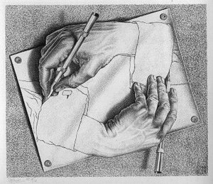
Escher's famous "Drawing Hands" explores the idea of paradoxes and "strange loops"

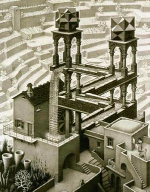
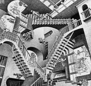
The well-known, innovative 20th century artist M.C. Escher was the creator of, in a phrase, “art for science and math lovers.” Infinity, polyhedra, geometric distortions, tessellations, impossible constructions – they’re all there somewhere in his work. Crazy, no? He didn’t even have any formal mathematical training. That’s even crazier.

I cannot pretend to comprehend much of what I read about him. There isn’t exactly a lot of discussion about technique and aesthetic. Instead, it’s more about Penrose triangles and orthogonal forces of gravity. Not quite the type of thing that I like to involve myself with. I have nothing against it. I just admittedly don’t understand much of it.  That’s what I think makes Escher so remarkable. I’ve spoken to quite a few Mathletes about art, and many of them told me that they just don’t “get” it. It’s markedly outside their comfort zone. Well, here comes Escher to the rescue. Scientists and mathematicians arguably enjoy his work more than anybody else.

It’s a remarkable feat, but Escher effectively managed to tether the worlds of art and technical logistics in a way that I do not believe anyone ever has. I mean, it’s art that penetrates a world that is inhabited by its theoretical opposite. In that way, it’s art that almost transcends the barriers that usually serve to confine it. We’ve talked a lot about the ever-expanding artistic intersection in our class – which includes politics, industry, and commerce, among others – and I think that Escher, with his mind-boggling work, adds mathematics to the list. So to those with a penchant for science I say you’ve found a remarkable associate in Escher. To those who are not quite so scientifically inclined (myself included) I say Escher is yet another brilliant artist to marvel at.

Rated Rt

Zach mentioned in our last class that second graders are more familiar with Da Vinci and Picasso than with any of the modern artists on the scene today. I think that it’s a good observation, but like most good observations, I’m not about to leave it at that. Zach suggested that the reason behind this “deficiency” (for lack of a better word) is that so many people are considered artists today that it’s almost impossible to determine who is worth telling kids about. I do agree with that explanation, but I’d like to offer an alternative one. Perhaps – and this could be entirely off the mark – it has something to do with censorship.

Renoir's "Mademoiselle Legrand, 1875" is an innocuous painting, both graphically and conceptually, that is most definitely suitable for a younger viewership

I make sweeping statements a lot in these posts of mine, and I guess this one will be no exception. Take this with a grain of salt, okay? So this is my gross generalization: Classic/older art = more subdued, less questionable content. Modern/post-modern art = brow-raising, sometimes downright shocking content. I know it’s not entirely true regarding every individual work (and it might not even be true as a generality), but I think that part of the reason kids don’t know about say, Tracey Emin, but do know about Da Vinci is because of a certain hesitance on behalf of parents and educators to expose children to certain, um, mature elements of art. Maybe not. You can just scratch this whole theory if you want. Now that I’ve worked it out in writing, I’m not sure I agree with it so much either.

But onto my next point – censorship need not imply filtering out potentially corrupting material. As in, determining age-appropriate content in general involves considering conceptually age-appropriate content as much as it does visually age-appropriate content. Ready for my next generalization? Classic/older art = more point-blank and concrete. Modern/post-modern art = more malleable and abstract. On a pedagogical level, it would be ridiculous to expose children to abstract art and expect them to appreciate it without first determining whether or not they are cognitively capable of comprehending it (my post about The Willing Suspension of Disbelief touches on this). That’s why, like most kinds of effective instruction, art education comes in progressional drips. First – Rembrandt/Da Vinci. Next – Monet/Renoir/Degas. Then – Dali/Picasso. A while after that – bring on the big guns. What I mean to say is that there has to build-up to the cerebral crescendo that is conceptual art. It takes time, and it is probably most effectively conveyed to those who have passed adolescence and tweenhood. That’s why third graders don’t go around displaying their knowledge about De Kooning and Duchamp (not that many adults go around doing that either). I think this aspect of “censorship” might play a big part in Zach’s observation. It’s not censorship in the negative sense of the word. It’s merely in the pragmatic sense of the word. It opens up a whole new discussion about the nuances of art education – when to begin, how to begin, what to include, what to leave out, etc. Thankfully, that is not what my post is about, as those are all questions that I don’t think a day’s,week’s, month’s, or year’s worth of deliberation can effectively answer.

What’s the Pompidou?

The Pompidou Centre is one of those museums that you should have heard of, but probably haven’t. At least, that’s what it was for me. I was introduced to it by the most unlikely of sources – a Rabbi in Israel – and the context in which he mentioned it was quite interesting as well, but nonetheless irrelevant to our discussion here.

Centre Georges Pompidou, as it is known in French, is a museum in Paris, France. Now, if I were to finish with my introduction now, I would not quite do the museum justice. Why’s that? Because I left out one teeny, tiny fact. And what might that teeny, tiny fact be? It’s kind of built inside-out.

Inside-out? Yes, inside-out. What’s that mean? I hardly know the extent of it myself, my friends. But I can tell you that the piping is all on the outside so that if you were to pass by the museum, you’d think it’s just some kind of extensive scaffolding. It’s really quite an eyesore. Supposedly, the builders of the museum were protesting against the idea that art has to be a certain way. To that end, they built a museum that defies the idea that a museum has to be a certain way.

I guess I just have one question – would you go so far as to compromise aesthetic for the sake of “art?” I think that like ALL matters in art, the answer to that is entirely subjective. There’s a number of issues that can arise:

The Pompidou Center is not quite, shall we say, pleasing to the eyes

Who says that piping on the outside of a building is a compromise of aesthetic? Just because I think so doesn’t mean that it is unequivocally so for all others. On that note, is there even a standard of “aesthetic?” Sure, we’ve come to the conclusion that art has hardly any standards. But is aesthetic subject to the same terms? And maybe compromising aesthetic for “art” is essentially art? Like we said in class, being unafraid to push boundaries when following your “vision” is something that defines an artist. So maybe forgoing aesthetic is a part of that? Lastly, maybe museums DO have to be a certain way? I don’t know about anyone else, but I am a selective purist when it comes to architecture (selective meaning to say that sometimes I do find unconventional structures appealing here and there). I would be, and am, put off at the thought of a structure like the Pompidou Centre. I probably wouldn’t even enter the place, which you can say is my loss but then I’d have to ask you “what exactly would I be losing, pray-tell?”

All in all, the Pompidou Centre is an intriguing place. Like most post-modernist art, I am more fascinated by the debate it elicits than “it” itself. But maybe that’s all it’s there for in the first place. If there’s one thing I’ve learned this semester, it’s that I’ll never quite know how to settle that issue once and for all. (The fact that I am actually okay with that just proves how far I’ve come.)

The Willing Suspension of Disbelief

Coleridge meant it about writing. I mean it about art.

I don’t want to nitpick art into bits, but I think this is an important issue. There are many who take a literal approach to art, and while that may not be fundamentally wrong, it is fundamentally juvenile and unfortunate. As a kid, I remember when my dad would sit me down for some impromptu art lessons. One time, he showed me a picture of a deformed multi-colored face (I think it was “Dora Maar”) and said “This is a Picasso.” I said “Eww” and asked “Why is Picasso’s face all mushed up?” He laughed and said “No, no. Picasso painted this face. It’s not a picture of him.” “Oh,” I said. “Then Picasso was probably a stupid artist.” I had really meant that. Didn’t he know that human faces don’t have two noses? It took a while for my dad to explain, but when I got the concept, I finally understood something fundamental about art – while my first grade classmates extolled me for drawing a good and accurate picture of a house, that was not where the artistic process ended. If anything, it only began at that point. Later, when I grasped the notion that art need not be literal, it was practically a paradigm shift.

Picasso's "Dora Maar"

Many people can draw a lifelike person. In fact, there is hardly anything “creative” about that. The creativity lies precisely in what you do with the fact that you are capable of drawing a lifelike person (now that I think about it, this actually relates a lot to my previous post). When you are unafraid to manipulate what your eye sees and what your pen produces, that’s when you really immerse yourself in the creative process. But this is all from an artist’s point of view. As a spectator (a role I admittedly assume a whole lot more often than artist), the same holds true cognitively. When you can appreciate that which is off-kilter and unconventional, that’s probably when you start to really recognize what creativity is. I’m not saying you have to like Picasso. I’m saying you have to understand Picasso. To do that, you need a “willing suspension of disbelief” which, at least from the way I see it, is essentially what a creative perspective is all about. (Of course, I shouldn’t make such sweeping statements, especially about something as ineffable as art, but I like the fact that certain concepts like Coleridge’s can be “multi-disciplinary,” and applied less exclusively than originally intended.)

I Can Do That Too

We all know what I’m referring to. It’s the notorious line that follows the usually snide interjection – “that’s art?!” What I want to propose is that we shouldn’t be so quick to judge. Sure, you can also paint a canvas red. But have you?

The first and main thing to consider is this: sometimes skill is essentially irrelevant. I recall when a classmate (sorry, I don’t remember exactly who it was) once remarked “What I want to know is whether those artists who draw scribbles are also capable of drawing a technical work because then, I’ll think they’re actually artists.” I thought that was a fair statement, but then I started to think – Are artistic talent and artistic skill one and the same? Sure, there is a technicality to art. You need perspective (as the “rudimentary” Islamic art we saw the other day suggests), and a technique, and a specific kind of brush stroke, etc. etc. But a person who has mastered all these things isn’t necessarily an artist any more than he is a skillful brush handler with a good eye. I think that to be an artist you have to almost transcend all the empirical things and grasp something a bit more abstract – what I call artistic talent. You need a vision, a certain kind of creativity, a different way of looking at the world. To me, that’s what makes an artist.

If I see a pink canvas with a single white line down the middle, I’m not about to doubt the validity of the artist who produced it on the basis of it being “too easy” and that “anyone can do it.” In fact, I actually dislike that claim. If “anyone” can do it, then why haven’t they? Why was it only this one artist? What’s more, how do you know that what you are looking at is not the product of years of hard work? The best example of this that I can think of is Yves Klein’s IKB. IKB, or International Klein Blue, is the name of a painting by Klein. At first glance, it’s only a deep blue canvas, but it’s really so much more than that. IKB is actually a color that Klein, together with some chemists, developed. That’s right – that blue on the canvas was basically invented by Klein. He was looking for a color that would best express the concepts he wanted to convey through his art. When he couldn’t find one, he just made one. We have always known that sometimes, there is more than meets the eye. One of the best places to apply that concept is in the art world.

Mondrian's "Broadway Boogie Woogie"

Mondrian’s “Broadway Boogie Woogie” is another example. It’s certainly a dazzling canvas, but if you look at it closely, it’s just a bunch of colorful squares. “I can do that too,” right? Maybe. But again, that’s not all there is to art. Mondrian’s genius lies in the title of his work, really. Knowing the title and looking at the work, the squares take on a whole new meaning. Something basic suddenly transforms into something ingenious. The grid of NYC streets, the bluesy boogie woogie  – it’s all there in those squares. So yes, you can draw squares too, but can your squares tell a story? Probably not.

There might be some of you who can argue that if you drew a bunch of random circles and called it something like “The Meaning of Life,” people would think that it’s an ingenious work of art too. But that would be accusing the art community of being opaque and capricious, which it isn’t (at least for most of the time). It is also likely insulting to those artists who do actually consider every minor etch in their work. To them, it’s mockery in its basest form. To be an artist requires that you take creative expression seriously. You cannot be flippant about what you are producing, even if what you are producing is satirical in nature. Artistry, when all’s said and done, is serious business.

(I acknowledge that I have neglected to mention the phenomenon of the ready-made, but that is because I think it’s an entirely different story altogether that I did not want to get into.)

Cy Twombly’s Inspiration

De Kooning's "Dark Pond"

I think the De Kooning was my favorite art exhibit we saw all semester. Actually, I don’t just think – I know it was. I mean, Matisse and Hals aren’t quite my cup of tea and as much as I appreciated the works we’ve viewed hitherto, I never quite enjoyed them. They hit me on a purely objective level (more logos than pathos), and I didn’t really feel that any exhibit provided an immersive experience.  All that changed with De Kooning at the MoMa. Don’t get me wrong – I’m still not quite what you would call an abstract art aficionado, but I found his overall style and color palate a lot more appealing than say, Gauguin’s (I know I’m sort of comparing apples and oranges, but my first criteria for whether or not I like a work of art is the color range. Gauguin’s vibrancy is not so much my style, whereas De Kooning’s colors, although saturated at times, were much more muted and thus, more appealing to me). A lot of his work was extremely thought-provoking and even poignant at times, at least from my perspective.

Twombly's "Untitled, 1953"

The pieces I found most intriguing were the black and white paintings. The moment I spotted them, I turned to Ayala and said “these remind me of Cy Twombly and his chalkboards.” She responded “yeah, they do look a little like chalkboards.” Now, Cy Twombly, if you must know, is not really my favorite artist by any means (click on his name to view some of his works). I guess it’s strange of me, but there is one piece of his that I do happen to find appealing. It’s called “Cold Stream” and it’s basically a row of white spiral scribbles on a black board. Call me crazy, but I actually think this piece is incredible (both conceptually and aesthetically). In any case, I have been known to make arbitrary associations between things, and so I wondered whether De Kooning and Twombly were an exception. Was there something behind my alleged connection between these two artists?

After a quick Google search, I was brought to a website called The Art Story: Your Guide to Modern Art. I quickly scrolled down the page as I skimmed the site’s history of Twombly, and then I came across this line: “Twombly’s work at this time (1952) was largely in black and white, influenced both by Robert Rauschenberg’s paintings and the monochromatic work of Willem De Kooning, Franz Kline and Robert Motherwell.” Eureka.

For those who wish to see some more Twombly  “Cy Twombly: Sculpture” is on exhibit at the MoMa until January 2.

An Artist Remembers

There is art for the sake of art, and then there is art that serves a purpose.

Ornate lamps like this one from late 19th century Eastern Europe are on display in the Jewish Museum's exhibit

When it comes down to it, it’s about the difference between art that is produced for an aesthetic purpose and a functional apparatus that happens to simultaneously serve an aesthetic purpose.  Simply put, sometimes art is only a fringe benefit. That should not be taken lightly. At least, the Jewish Museum doesn’t seem to think so. On December 2, the museum unveiled a new exhibit called “An Artist Remembers: Hanukkah Lamps Selected by Maurice Sendak.” Now, Hanukkah lamps are not typically meant for museums. While they are often seen on display, their first and foremost role in Judaism is entirely functional. Any artistic quality they might assume is only secondary to their original, intended purpose. Of course, this is only on the condition that it is Hanukkah time. I happen to find this mere observation intriguing enough as it is, but there’s a lot more about the exhibit that warrants interest.

According to the Jewish Museum’s website, most of the thirty-three lamps on display come from Eastern Europe. Thus, a large part of the lamps are surviving remnants from Jewish families who went through the Holocaust. For renowned author and illustrator Maurice Sendak, whose own parents were Holocaust survivors, selecting the pieces was a moving experience, one that profoundly stirred his deep sense of loss for family members who perished in the Holocaust. “We hope that visitors will be moved in various ways by the lamps. For Maurice Sendak, they are powerful repositories of memory, embodying stories that illuminate the past for new generations,” remarked Susan Braunstein and Claudia Nahson, the organizers of the exhibit. The public is invited to share their thoughts on the exhibit on a board that will be displayed in the museum.

It is not often that one finds such a poignant crossroads of history, art, religion, and collective memory all in a single exhibit. It sounds like quite an informative and inspiring experience. The exhibit closes on January 29, 2012.

Joseph Kosuth Takes On Plato

Joseph Kosuth’s “One and Three Chairs” is possibly one of the most ingenious works of conceptual art on the planet. I can’t believe I haven’t blogged about it before. It’s my favorite piece of art ever, namely because it evokes one of the most influential philosophical theories to ever emerge i.e.  that of Plato’s Allegory of a Cave. That a single work of art can basically convey a profound and complex philosophy is something that I happen to find extraordinary. But, as usual, I’m getting way too ahead of myself here.

First, let me briefly explain Plato’s cave parable. I might fail miserably at this as I am no philosopher, but bear with me. Plato presents the following scenario: Imagine someone who has been imprisoned in a cave from the day of his birth. He is chained so that his back faces the opening of the cave. All that remains within his line of vision are the passing shadows created by the sun’s rays from behind him. He thinks that those shadows are all there is until one day, he escapes and he is able to see the world as it really is for the first time. He realizes then that what he had taken to be the world were merely shadows on a wall.  So it is, says Plato, with us and the world we sense with our five senses. The empirical, solid world is just a shadow.  So if we see many different kinds of trees, we shouldn’t fool ourselves. What’s real is not the various trees we see, but the one idea, concept, form of a tree. Whether or not you agree with the philosophy is one thing. Whether or not you think it’s a paradigm shift in thought, which it is, is another. Thus Plato.

Now we move on to Joseph Kosuth. I’m not sure whether or not he had Plato in mind when he created his “One and Three Chairs” back in 1965, but maybe that’s irrelevant. Either way, the exhibit, pictured below, was this: A chair, a photograph of the chair as it appears in the room, and a dictionary definition of the word “chair.” The way I see it, Kosuth is challenging the viewer to think on an extremely philosophical level. He titles the piece “One and Three Chairs” but how that title is interpreted is entirely up to the viewer. As in, the “one chair” he refers to could either be the physical chair or the definition of the chair or even (if you’re really ambitious) the picture of the chair. That all depends on what you think is real, on what you think you are looking at (which is where Plato comes in). There is a way, obviously, to support all three opinions, but maybe that just points to one profound observation: To accurately represent a chair, you need all three representations. If you were trying to explain a chair to someone who had never heard of one before, what would you need? An actual chair (or a picture of a chair, in case you haven’t a physical one) and a definition of what a chair is. Without these, you cannot be expected to give a proper explanation. Thus Kosuth.

Now, I am certainly willing to acknowledge that I am reading way too far into Kosuth, ergo I am attributing more ingenuity to his work than it merits. But isn’t it a crazy thing? A work of art can be powerful enough to elicit philosophical discourse. I know of no other medium that can claim to do that so effortlessly. But that’s art for you, I guess.

Fashion: A Lost Art?

And by lost I mean forgotten and by forgotten I mean marginalized. But I guess I should be a bit clearer. When I say fashion is a lost art, I’m not referring to the mega-successful fashion industry. I’m talking about an individual’s sense of fashion. The way I see it, everyone’s distinct sense of style attests to a certain artsiness (yes, that is actually a word) inherent in every human being. I know that’s a broad statement, but fear not – I shall expound.

Fashion bloggers/photographers like The Sartorialist immortalize the most ubiquitous form of creative expression through taking pictures of original ensembles they spy on the streets

There are many definitions one can give to the word “art.” The one that the dictionary offers, and that I myself happen to espouse, is “the expression or application of human creative skill or imagination.” If that is the case, then, isn’t the way someone dresses him/herself a form of art in its own right? Even if someone doesn’t put much thought into his/her daily ensemble, the piecing together of certain articles of clothing, however well or poorly pieced together they may be, is a legitimate act of creative expression in the literal sense of the word “art.” In that way, isn’t everyone an “artist” to some extent?

To be sure, as in every artistic genre, there are artists who excel and artists who fall short. (I’m not quite sure where the objectivity lies in such a form of artistic expression, though. As in, what determines if someone is dressed “better” than someone else? Skill is not really a factor, as I think we’re all more or less equally adroit and experienced. I would love to press further into the issue, but it would constitute an annoying digression that, frankly, I haven’t the time for at present.) My point is that fashion is an art form available to everyone. Obviously, consumerism plays a role in fashion but it is pretty much free from most of the fetters typically imposed on other forms of art. Think about this way: With clothing, for a relatively small sum, you can turn yourself into a walking form of creative expression. And you do. Everyday. There’s no need for museums either. Just walk outside and the streets become the exhibit.

Of course, I’ve only scratched the surface. There is more to be said about the issue, but I think the main thing about it is that it warrants a fresh perspective on the otherwise exclusive art world. The common folk are allowed in, it seems, if only for a moment, through the wide world of fashion. So don’t lose sight of that the next time you bemoan your creative deficiencies. You’re more creative than you think. The proof? Well, you’re wearing it.


Picture Occupy Wall Street

It’s a saying that’s been repeated by dutiful teachers probably since the beginning of time – don’t judge a book by it’s cover. While I’m not here to argue the upsides of that statement, I do want to pose a question using that age-old adage as a template of sorts. If we are not to judge a book by its cover, are we also not to judge a movement by its banner? I ask because I think the question is warranted, and its answer is not as simple as it may seem. Allow me to explain.

Slogans and banners have long been the trademark of political campaigning. Those of us who sat through a whole year straight of American History in high school can tell you that even before television, campaigners utilized political images and easy-to-remember one-liners as a means of advancing their candidate’s popularity (see “Tippecanoe and Tyler Too” from the elections of 1840). Then, once television became an established form of media, campaigners turned to short commercials for promotional purposes. (The Living Room Candidate, a website from the Museum of Moving Image – located in Queens! – documents commercials from the elections of 1952 to 2008. Check it out if you have the time. It’s pretty fascinating stuff.)

Now, what exactly am I getting at with all this? To answer that, I’m going to need a little help from The Living Room Candidate: “Television commercials use all the tools of fiction filmmaking, including script, visuals, editing, and performance, to distill a candidate’s major campaign themes into a few powerful images. Ads elicit emotional reactions, inspiring support for a candidate or raising doubts about his opponent.” What I want to argue is that a political movement is rendered less effective if it fails to utilize images and popular slogans. In fact, a powerful slogan or poster can be of immeasurable promotional help. I’m sure we all remember those popular Obama posters by Obey Giant splashed across t-shirts, pins, and other apparel during the 2008 elections. If you wore one of those items back then, you were considered officially “cool.”

Now, enter Occupy Wall Street into the above picture. While scrolling through their website, I found their Posters and Materials page most interesting.  There were fifty-some posters on the site, each original, informative, and eye-catching. What I found most surprising, however, was the little blurb to the right of the page: “We have compiled the beginnings of a Designer Toolkit for those wanting to use the Occupy Together logo and foundational WordPress theme used on this site.” Super cool, I thought. Apparently, Occupy Together is well aware of the impact a single catchy image can have. On that note, Picture the Homeless, an organization I learned about from the Homelessness in Focus lecture, seems to be on the right track as well. They already have a moving slogan – “Don’t talk about us; talk with us!” – and one quick look at their website shows that they are utilizing the image factor as well. I should note, however, that the practical difference between Picture the Homeless and Occupy Wall Street is significant. Whereas Occupy Wall Street as a political protest could always stand to use better lobbying techniques through various media, Picture the Homeless conveys a message that speaks for itself, regardless of how effective or ineffective their methods are. What I mean to say is that the issue of homelessness is one that can stir anyone into action, even if it has no accompanying image or slogan. With Occupy Wall Street, it’s not quite the same story.

To conclude my post, I turn again to The Living Room Candidate. I was so impressed with the website that I started to explore a bit. I’m glad I did, because I found this awesome link. Meet AdMaker – an educational site that allows you to make your very own political commercials (complete with videos, images, and sounds). It’s the best way I can think of to demonstrate how much artistic skill is needed in the political arena. Plus, it’s super fun!

Of Art and Politics

When Thursday’s class veered off into a discussion about art with political implications, I found myself wracking my memory for artists who promoted this kind of expressive propaganda. I realized that there are actually quite a few. This post will not be concerned with weighing the effectiveness of these endeavors. All I wish to do here is point out that there have been many (sometimes inadvertent) attempts in recent years to fuse the academies of art and politics.

First, let’s talk aural art – by that I mean music. We pointed out in class that there is no band that accurately captures the zeitgeist of the recent political turn this country has taken. While I agree with that observation as a generality, I think there are modern musicians who do concern themselves with some politics from time to time. Take Coldplay, for example. Their last album “Viva la Vida or Death and All His Friends” was teeming with political themes. Delacroix’s “Liberty Leading the People,” the well-known illustration of the French July Revolution of 1830, graced the cover, while within the album itself, tracks like “Violet Hill” and “Death and All His Friends” carried unmistakable political implications. There are other examples from contemporary musicians, like the punk-rock mavens of Green Day, popular hip-hop artists Jay-Z and Kanye West, and the notorious John Mayer. These efforts are not confined to modern music. Sociopolitical commentaries have been surfacing in music for centuries. Just look at Mozart’s Don Giovanni – while it might be a stretch to say that the opera is predominantly politically charged, there are quite a few sociopolitical inferences (like the dichotomy between the upper and lower classes).

Political themes in visual art are even more ubiquitous. A mere cursory look at my favorite genre – photoconceptualism – will render a plethora of politically active photo-conceptualists. There’s Barbara Kruger and Martha Rosler, who in their respective “Untitled (Questions)” and “Bringing the War Home, House Beautiful” use visual means to question American foreign and domestic policy, among other political messages. There’s the notorious Viennese “Actionists” (more accurately, anarchists) of the sixties like Rudolf Schwarzkogler and Hermann Nitsch, who staged daring actions that they photographed. Their usage of frightening iconography was plainly meant to convey their dissatisfaction with the sociopolitical conventions of post-war Vienna (I’d rather not provide a link to these two, since the images are WAY too disturbing. Google at your own risk). Even artists with whom most people are familiar – like Andy Warhol and Jackson Pollock – could not resist incorporating some political undertones (click on their names to see examples). Perhaps most noteworthy is Banksy, the notorious graffiti artist who I’ve blogged about before. Not just some, but MOST of his work is political in nature.

Elsewhere in the arts, we have Alvin Ailey’s “Revelation,” which deals with themes of slavery and discrimination through the medium of dance and Wallace Shawn’s “The Designated Mourner” as an example of political theater. Architecture is perhaps in a league of its own, since most of the political controversy it generates is unintentional. In my Urban Studies class, we did a unit on the militarization of public space, where we pointed out that a lot of the city’s architecture is designed to keep “undesirables” out. The Frances Howard Goldwyn Library in Hollywood, California is the best illustration of this phenomenon – the library, which is supposed to be a public space like all public libraries, has been designed to look like a high-tech fortress. The assumption is that the library’s imposing presence will intimidate or discourage certain unwanted people from entering. And this is just one of many examples of using art and design to further a political agenda.

With so much political infringement on art, the obvious question is whether or not political messages are successfully conveyed through the artistic medium. I think the answer is yes, but I readily welcome a more thorough analysis on the issue. On second thought, maybe I’ll just blog about that next time…

Photography’s Renegade (or Ready Made)

Consider this: It’s a nice Spring day in 1969. Vito Acconci walks out of his loft in Brooklyn, camera in hand. He spies a subject and begins to follow him. When the man turns a corner, Acconci follows suit. When the man crosses the street, Acconci is not far behind. He snaps pictures of the man’s back when he can. The man doesn’t seem to notice. The man hails a cab. Acconci ends his pursuit. About thirty years later, a collection of photographs entitled “Following Piece” are purchased by the Metropolitan Museum of Art. The photographer? Vito Acconci.

It’s a troubling question – when exactly does a scheme of stalking turn into art? Or rather, how can it? At it’s core, it’s not a question we haven’t thought about before. Just take a look at Shane’s and Ayala’s recent posts. We’ve seen it played out time and again with Hirst’s dead shark, DuChamp’s “Fountain,” Picasso’s bull’s head…the list goes on. Acconci’s piece is basically the controversial ready-made, the “please, even I can do that,” only redefined for photography. The result is photo-conceptualism. As its adherent, Acconci is not alone. There are countless others who are no less brow-raising. A few that are worth mentioning:

Long's "A Line Made By Walking"

Richard Long – his “A Line Made By Walking” was exactly that. He walked up and down a particular patch of grass, forming a path that he then photographed. Bruce Nauman’s “Self Portrait as a Fountain” was just a picture of him spitting out water and all Valie Export did in her “Rounding Off” was line herself up against the curved edge of a sidewalk.  Perhaps the best examples are Sherrie Levine and Richard Prince who, in their respective “After Walker Evans” and “Untitled (Cowboy),” were essentially just photographing already existing photographs.

It is interesting to note, however, that the performative aspect of the art is what most people seem to find an issue with. Hardly anyone will debate the artistic value of the rendered photographs. I’m not quite sure what the reason is for this phenomenon. Maybe it’s because people find photographs aesthetically appealing for the most part. Or maybe it has to do with the fact that much of society has been trained not to take a photo at face value (the oft-quoted adage “a picture is worth a thousand words” attests to that, I think). Either way, I find myself increasingly ambivalent towards the genre. I used to love it (hence, the above) but lately, I’ve been starting to wonder: When the culture around me starts to celebrate as art something that, in any other context, would be sufficient cause for incarceration/a restraining order/hospitalization/psychotherapy, shouldn’t I be just a tad concerned?

Banksy: World’s Most Wanted Graffiti Artist

Ilana’s post about the fabulously eccentric Italian artist Cattelan reminded me of a certain artistic vandal no less worthy of mentioning. I would introduce him by his proper name at this point, except he hasn’t one that the public knows of. He is simply called “Banksy.”

Banksy’s work is cheeky, often irreverent, and usually imbued with some brow-raising political undertones (see above picture for a good example). Blurring the lines between defacement and art, Banksy’s expressive medium of choice is the street. And he doesn’t just confine himself to one locality – his graffiti has popped up in places like NYC, Australia, England (his home base), Detroit, Greece, Israel, Paris, and New Orleans. With such a large collection of targets and a sizable moneyed following (his aficionados have paid up to half a million dollars for his work), one would expect Banksy’s identity to be widely known by now. Not so. Those who know him, like his agent, refuse to deny or affirm supposed identifications. The elusive Banksy thus remains a mystery. Although that might just be half his appeal. After all, how often does the world encounter a notorious but anonymous street artist with a wicked sense of humor to boot? I’d venture to say not too often, which is what, I guess, makes Banksy the world’s most wanted vandal.

For more Banksy information, check out his book Wall and Piece and his Academy Award nominated documentary Exit Through the Gift Shop.

Muppets: The Green Album

Today marks the birthday of arguably one of the most influential men to walk the universe i.e. Jim Henson, the creator of the Muppets. As such, I can’t let this momentous day go by without sharing this super cool album (which I actually remembered a few days ago thanks to Joseph’s post). It’s a rather clever idea: a collection of popular Muppet songs covered and reinterpreted by contemporary artists.

I initially thought that the album would be an unfortunate compilation of saccharine tween-y pop and banal, maudlin ballads, but when I sampled some of the songs, I was relieved to be proven otherwise. The Green Album features a diverse selection of artists, with styles ranging from alternative metal (Amy Lee) to indie pop (Sondre Lerche). It’s hard, then, not to find at least one song on the album you like. My favorite track? The Fray’s quirky rendition of “Mahna Mahna.” It puts a smile on my face every time I listen to it, which I guess is ultimately what Henson’s ingenious Muppets are all about.

Click here to listen to the album.