Archive for the Uncategorized Category

The Concert at Carnegie Hall, and the tour of Carnegie Hall

Posted in Uncategorized | No Comments »

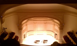
We went to Carnegie Hall to see a concert with two pieces, Violin Concerto in D Major by Beethoven and the Harmonielehre by John Adams. The story is that the beginning of the Violin Concerto was inspired by someone knocking on his neighbor’s door five times in succession. Similarly, John Adams was in the midst of a long period of writer’s block when he wrote Harmonielehre. He was inspired by a dream he had of an oil tanker coming out of the San Francisco Bay and zooming off like a rocket. The famous violin prodigy/soloist Midori played in the Beethoven piece and she was amazing! So much energy and passion. The John Adams piece was very different from anything I’ve heard before, but it was also extremely good. A few days later, we took a tour of Carnegie Hall with the Archivist himself. Here are some pictures of an empty Carnegie Hall:

Chelsea Galleries! Daniel Canogar, Chris Doyle, Abelardo Morell, Mary Temple, and Roxy Paine

Posted in Uncategorized | 5 Comments »

Daniel Canogar Trace
I found Daniel Canogar’s work to be extremely insightful and interesting. His primary material is garbage that he finds in nearby dumps. For his Spin piece, he mounted 100 DVD disks on the wall and reflected a short part of the movie onto the opposite wall. The reflections were not in perfect lines, so some of the circles looked particularly distorted. In this piece Daniel was trying to show our culture’s fascination with flickering images while simultaneously expressing the alarmingly short life of pop culture. Each of the movies represented took an enormous amount of work to create and distribute, and they all end up forgotten and in the trash. The short sequence of each movie that is show also serves to show that most movies or other media are only remembered for one very small part of the whole. His other pieces in the gallery were made out of old telephone and computer wires. Daniel rigged up the wires so that there is light coursing in and out of them, simulating the sound energy that once flowed through them. Here we see the same themes of having a short lifespan and the utility of garbage.

Chris Doyle Waste_Generation
The main piece of this exhibit was the extensive hand-drawn animation, “Apocalypse Management”. The major themes of this piece were waste, the cyclical nature of things, rebirth and nature. Doyle was obviously influenced by September 11th, and the animation cycles between being bright and lively and dark and dystopic. The color green was used very heavily. This piece bore many similarities thematically to Daniel Canogar’s work, as it explored the themes of life, time, waste and a sense of being overwhelmed.

Abelardo Morell The Universe Next Door
This exhibit was very interesting in that it used a photography technique, camera obscura, that I was not very familiar with. All of the photographs in this gallery used this technique, which essentially allows you to project an image onto another image. There were many very intriguing examples of juxtaposition in this gallery, including an image of a bed projected onto an image of New York City, which plays around with the phrase “the city that never sleeps”. Another photo projects an image of a crowded bookshelf onto an image of some kind of rural countryside. Here you can also see themes of time, industrialism and cycles.

Mary Temple Among Friends and Enemies
One of the pieces at this exhibit was very similar to the Herald Tribune piece from the Guggenheim Museum Haunted exhibit. In fact, it was pretty much the same idea except the papers were from a recent time period. The same concept of taking out the words and letting the pictures and the position of the pictures tell the story was present, however. I find it very interesting that this is the way most people read newspapers now. The news companies are very careful about the facial expressions of the political figures in relation to where they are on the page. Another piece in the gallery was of a beaver stuffed with paper designed for learning how to write script, with the signature of the matriarch of the Astor family all over the papers that were in a haphazard, crumpled pile below the beaver. This piece was apparently referring to a scandal where her son forged her signature and tried to take her fortune when she died. The beaver was the family’s symbol.

Roxy Paine Distillation
This piece was essentially a huge metal structure that looped around and went through the walls, filling the entire space of the gallery. The construction takes up a large portion of the space, so even though there is a lot of empty space, you are forced to move within the space in a very specific fashion. In another room, there was a large metal board hanging on the wall that was covered in metal mushrooms, creating a kind of simulacrum with the way the industrial (the metal mushrooms) was attempting to impersonate nature. The mushrooms looked as though they could be real.

Trip to the Metropolitan Museum: Big Bambu, Katrin Sigurdardottir at the Met, and Between Here and There: Passages in Contemporary Photography

Posted in Uncategorized | No Comments »

In Big Bambu, by the Starn Twins, Boiseries, by Katrin Sigurdardottir, and County Cork, Ireland by Richard Long, I felt that the primary alteration of perspective was caused by how each art piece utilized space, and the ensuing feeling of dislocation. Big Bambu was situated atop the Metropolitan Museum of Art, with a great view of the New York City skyline and the treetops of a small park below. Walking through Big Bambu caused me to feel as though I were in a gigantic cage, although I didn’t feel trapped or enclosed. Instead, I experienced wonderment and awe looking up and around at the numerous webs and patterns that were created by the intersection of bamboo stalks. The feeling of dislocation was caused by the combination of Big Bambu’s material of choice, bamboo, and the aforementioned space at the top of the museum. Walking through a tangle of bamboo is an experience enough on its own, but doing that while simultaneously seeing a combination of trees, the sky and the New York City skyline created an acutely surreal experience for my sense of sight that I doubt I will experience again any time in the near future.

The Boiseries created a much more sinister alteration of perception and sense of dislocation than Big Bambu. While Big Bambu was outside and generally pleasing, the Boiseries gave me the feeling of being in some kind of altered-reality, Willy Wonka mental institution. There was one in particular that was closed off so that you could not be inside. The interior was pristinely white, unnervingly so from my point of view, and the perfect arrangement of white furniture, gave me an oddly specific image of a young girl in an all-white dress sitting at the powdering table and talking to a doll. The two-way mirrors also added to the overall impression of an asylum. If I had to stay in that room I could definitely imagine myself losing a bit of my sanity.

Richard Long’s photograph County Cork, Ireland created a much more benign sense of dislocation. I sensed warmth and friendliness from this photograph, which was definitely enhanced by its silvery antiquity. I think that the sense of dislocation was caused primarily by the different ways you can perceive it. I think that this photo can be perceived both as a close up shot of a small, but perfect circle in the field, or as a kind of diagonal bird’s eye view of a very large circle in a field. Imagining taking this photo either from extremely close up or very far away plays with my mind’s eye and forces me to displace or dislocate myself in space. All three art pieces did a very good job of encouraging and enabling this dislocation in the space-time continuum.

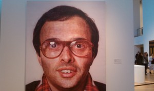
My favorite picture from the contemporary photography gallery:
And some pictures I took from inside and outside Big Bambu:

Snapshot Day

Posted in Uncategorized | No Comments »

For Snapshot Day 2010, our seminar class had to take a picture of a neighborhood in basically any fashion we wanted to. Although I’m from Brooklyn, I chose to take a picture in Manhattan because I wanted to represent the grandeur and antiquity of New York City. We had a photographer, Barron Rachman, come to class to try and give us a quick tutorial on how to better frame our photographs. Here are some of the pictures I took:

They are all from basically the same perspective, but I ended up choosing the last one because I felt that overall it best encapsulated both the grandeur, in the huge skyline, and the antiquity, with the sepia effect and slanted perspective. I also felt that the geometry in this picture is great. Barron showed us a lot of great pictures that utilized straight lines, and I felt that the New York City skyline was a great way to utilize this effect.

Meet The Artist: David Ellis

Posted in Uncategorized | No Comments »

David Ellis’s brand of art is easily one of my favorites, and hearing him speak about it personally was very art-inspiring for me personally. After learning that Ellis works a lot with motion painting, I instantly though of Blu, another very well known artist in the same field. Lo and behold, Blu was literally the first personal Ellis mentioned when talking about his work. Motion painting is very inspiring to me for the simple reason that it almost magically brings the art to life. This same effect is readily observable in art/sound sculptures that Ellis created as well. The amount of artistic vision needed to create motion paintings like David Ellis and Blu is simply astounding, and it sometimes makes me wish I had the ability to carry out ideas like that. I also like the idea of the “work of art” actually being the “work” that goes into making the motion painting. It never really ends, and it wouldn’t really feel right if it did have an end. I think that Ellis’s work was very artistically inspirational and I look forward to keeping up with his work in the future.

Ellis’s work “Truck”

David Ellis \”Truck\”

Here is an example of Blu’s motion-painting:

Blu \”Wall-imation\”

A Photo of his installation “Conversation”

MTA Art Transit Tour

Posted in Uncategorized | No Comments »

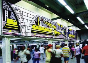
My favorite art piece from the MTA Art Transit Tour was definitely the Roy Lichtenstein at 42nd st Times Square. I’ve always enjoyed his work and it’s parody of Pop Culture. It is also very appealing to me on an aesthetic level. I also enjoy this work because it is something that you have to see by looking around out of your normal sight path. Most people zoom through 42nd st, their sole thought being to get where they are going. There isn’t anything necessarily wrong with this, but it definitely goes to show what you can find just by taking the time to look around and pay attention.

I would have to agree with most everyone else that Samm Kunce’s “Under Bryant Park” was the best example of site specificity. Most people don’t think about the fact that they are actually underground when in a subway station, but the expansive images of roots and nature were both aesthetically pleasing and a poignant reminder of what New York City’s heavily industrial nature often discards.

Joey Williams’ Skull Wunderkammer

Posted in Uncategorized | No Comments »

The photo is a straight-ahead portrait of the wunderkammer. It was inspired, as all of his work is, by his oppressive upbringing in the bible belt of the US. He used his art as a way to escape from the social norms of his society.

Hello world!

Posted in Uncategorized | 1 Comment »

Welcome to Macaulay Eportfolio Collection. This is your first post. Edit or delete it, then get started!