


Search this site
ITF Corner!
Hello from your friendly local ITF!New series of posts: Tips on embedding powerpoints and prezis on the blog, and embedding essays within prezis. Read more...
Before that: So you want to make a podcast? A powerpoint presentation. Read more...
-
Recent Posts
Recent Comments
- Sarah S on Times Square
- John Scanlon on A Losing Bet
- tejjybear on Is Technology Destroying our Culture?
- tejjybear on A Dried Herring, Please
- tejjybear on Too Much Diversity
Login
Carmen
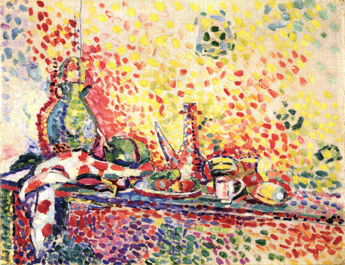
Having never been to the Opera before, I’m at the disadvantage of being unable to compare Carmen to any previous experiences. The show first hit the opera stage in 1875 and has transformed every year since. As social boundaries were pushed further, directors allowed for more scandalous seduction on the part of the actresses playing Carmen, in this case Anita Rachvelishvili. As it was my first time, I wanted to put a focus on each individual feature of the show that stood out to me.
The opera is different from Broadway for many reasons, mainly the constant singing and the fact that it isn’t actually anywhere near Broadway. However, the reason I was remembering my experiences at several Broadway theaters was because of the extravagant set at the Metropolitan Opera. The massive pillars that served as reminders of Seville, Spain were beautiful in there ability to create an archaic beauty as well as supplement the strength of the military soldiers that were marching around the stage. The dull colors helped compliment the intended effect of the cigarette factory as well as the obviously tragic storyline.

Credits to The Metropolitan Opera
From literally the last row of the Metropolitan Opera, it was far more difficult to visualize and appreciate the costume design of the cast, yet a pair of binoculars seemed to fix that obstacle. The costumes did their job of describing how the cast was to be seen, yet I didn’t see anything special in each individual character. I hoped to see something distinguishing Don Jose or something evoking sympathy for Micaëla. Since the story was set in much simpler times, it made sense to see Carmen’s more conservative clothing and she did a great job of bringing that seductive and scandalous attitude on her own.
I saw the acting as a roller coaster, with certain ups and certain downs (for the most part “up” though). For the most part, each individual character did a great job of evoking an emotion from the audience, whether it be sorrow, humor, or anger. However, at times the show seemed to be stretched out. It could well be that the show hasn’t adapted for a modern audience, or it is trying to bring the modern audience to understand classical opera. Yet I felt that certain scenes could be much shorter. For example, the scene where Don Jose is finally set to confront, and kill, Carmen. It could have been much more compact and allowed for the audience to feel the same emotion. By the end of the scene though, I was almost happy that it was finally over. What made it worse was the terrible death scene on behalf of Anita Rachvelishvili (Carmen). She wandered on the stage after being “stabbed” and again stretched out the scene. This is an area where many of my classmates disagree, yet I feel strongly about this.

Credits to The Metropolitan Opera
I were to assess this show as a whole, I can confidently say that it altered my expectation of the opera. I came in to the show thinking I was being dragged and left appreciating an evidently lost art. I still question if the show was trying to adapt to the modern audience or trying to allow the audience to understand opera and I still can’t confidently state an answer. However, I can confidently say that I am now more accepting of these lost arts that shouldn’t have vanished in the first place.
The Metropolitan Museum of Art Strikes Back
Coming to the Metropolitan Museum of Art drew from me the experience I had when I was a freshman in high school. At that time, I went to see Roman sculptures as well as ancient Egyptian art. However, four years later and here I am again at a class field trip to see an exhibit I never would have bothered to look at. That is the African Art and Matisse Exhibits.
What really amazed me was how the two exhibits were literally next to each other in terms of location. The African Art exhibit contained many sculptures and carvings that portrayed the human body whether alone, in couples, or families. Art was incorporated into unique objects such as spoons.
In the displays, there were multiple masks lined up next to each other. From far away they looked similar in technique and design yet upon further inspection of the carvings they were all very different at the same time. Proportions were not accurate but it was clearly the portrayal of the human face and body.
It became clear to me that African artworks are linked to the artworks by Picasso and Matisse due to the nature of Cubism and concept of abstraction. The Cubist movement used the methods in African pieces for inspiration. Cubism was also not in proportions to to the objects they were trying to represent yet there was a clear idea that a face is still a face. There are still two eyes a nose and a mouth. The only weird thing is that they do not look realistic at all.
The sculptures in African art often are created with geometric shapes and have many deep angles. The concept of abstract is presented beautifully in these sculptures and I can begin to see the elements artists like Picasso used.

The experience at the Matisse Exhibition was completely different for me. It was not about contrasting the differences and similarities between the two works but rather, Matisse created his work in pairs. He created two paintings of the same subject in an attempt to learn which technique he was more suited for. He created various perspectives by manipulating differences in seeing the same setting.
Matisse offers us a glimpse of the power of the eye and perception. There are amazing ways to convey not only imagery but information without losing out on the beauty and true meaning behind things. Because of this, it seems that creativity has been opened up to fascinating possibilities.
Overall, my visit to the Metropolitan Museum of Art was a really enjoyable one because the architecture still fascinates me and its a great opportunity for anyone in New York City to open their eyes to culture of the past and present. It was a great experience to learn about African art and actually see how something so basic and primitive is in fact a big factor when it comes to affecting future artist and their concepts.
Photography Packet & Terms
Photography, like any other art, speaks to people in different ways. Interpreting that art is a different conversation and is too often discussed. These readings allowed for me to gain interest in a whole new conversation, the importance of photography. With their reasonings, two authors stood out for me. Berenice Abbott and Larry Sultan had very interesting ideologies as to why photography was appealing for them and it really stimulated my mind to understand why I wanted to pursue it as well.
Berenice Abbott was a photographer, primarily of the 1930s and 1940s. Her story sheds light on her passion for capturing the significance of her time. She acknowledges that it has become a large aspect of human life to try and capture our lives. While living through the depression and World War II, it is needless to say that the times she lived in were interesting. They served as an example of what caused her to get interested, the fact that her time was inspiring. According to Abbott, “there is no more creative medium than photography to recreate the living world of our time.” That belief strongly appealed to me, because when I take pictures and look back on those from years ago, it’s the feeling of nostalgia that pushes me. The feeling of being taken back and having a grasp on another time serves as my motivation and I really connected with Abbott on that aspect.
Larry Sultan had a far different drive, yet it interested me because of it’s refreshing take on the matter. Sultan described how he used to take pictures as a child. His father would question him when he would use thirty roles of film and only take one or two pictures. His father always asked him why he only liked such a few amount. Larry would explain that he liked most of the pictures, but he would only publish the ones that worried him. He described an event where a picture of his mother was interpreted differently by Larry and his father. The understanding of opposing messages from the same picture interested him and although it isn’t what really drives me, it definitely interested me.
Some terms for our class to keep in mind are:
Aperture- A space through which light passes in an optical or photographic instrument, esp. the variable opening by which light enters a camera
Negative- The developed film that contains a reversed tone image of the original scene
Underexposure- A condition in which too little light reaches the film, producing a thin negative, a dark slide, or a muddy-looking print
Vignetting- A condition in which too little light reaches the film, producing a thin negative, a dark slide, or a muddy-looking print
Zoom Lens- A lens in which you adjust the focal length over a wide range. In effect, this gives you lenses of many focal lengths.
African Art and Matisse
My idea of African art was a very basic perception of the disproportionate features of the human to their actual body size. I would remember briefly seeing heads far too small for their bodies and breasts far too large for the woman. That was merely how I remembered African art and our trip to the Metropolitan Museum of Art was a great way for me to rediscover and understand the meaning behind the art. It served as an opportunity for me to realize that there is so much more to it than disproportionate subjects.
Our entrance into the exhibit led to a sharp understanding of what encompassed African art. It displayed the focus on specific features and aspects of life that made the pieces more appealing, and explained my previous perception of disproportionate body parts. Some pieces would have a strong emphasis on the teeth, by pushing out the jaw and creating a deep imprint around each individual tooth.
One piece that stood out to me was the Maiden Mask. As I previously mentioned, it too put an emphasis on the teeth and pushed out the jaw, however, there was so much more to its beauty. The elongated nose created a sleek feeling to it, adding some contemporary beauty, which appeals to the modern taste. There were essentially two main colors on the mask: beige and brown. Both match well and were used to appeal aesthetically. Though the main highlight of the Maiden Mask was on the elegant and intricately made headwear. The mask was a representation of woman, yet men wore it to dance with. The headwear held small little containers, which in my opinion stand as symbols of water containers which women used to carry on their heads (the museums text didn’t specify). It was so well made that when I reminded myself it was from a far older era, in a place with scarce resources, I was left speechless.

Credits to The Metropolitan Museum of Art
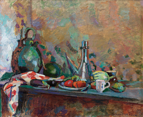
After the African exhibit we went directly to the Matisse exhibit. In all honesty, I have never been a fan of French art, or European paintings in general. I see people look into the subjects and I feel sometimes they look too far and misinterpret something which should just be appreciated at face value. Now that I have made my confession, it will allow me to better explain how I saw Matisse’s work. The pieces were great, not because of the subject matter, but because of the technique. I can’t even recall some of the subjects which he attempted to portray, but the way the colors were used is still fresh in my mind. It was different from other artists, because he painted each color as a dot and constantly pressed them around the painting, making it seem as a constant stroke from far. I saw the genius when he would place colors side by side to create the illusion of another color. The work was interesting to me because I truly hadn’t seen anything like it and I wondered how revolutionary it must have been for his time. Below is an example of the style which I was referring to:

Credits to The Metropolitan Museum of Art
A Different Approach to Humanism
The selection of pieces in the African art exhibit of the MET seems strange. Our perception of strange, however, is subjective to the art that we have grown to appreciate. When we dream in paintings, we often visualize Baroque-style art that emphasizes each muscle, vein, and skin tone of the human body. To depict with realism, and perhaps to add a divine quality, was the norm for the multitude of artists that that created “European Paintings”, or at least, the corresponding exhibit at the Metropolitan Museum of Art.
African sculptors depict the human body in a way that is radically unique. Without focusing on the intricate details of the general human physique, they bring emphasis to the most important parts of the face. The “Sculptural Element From a Reliquary Ensemble”, as shown in the exhibit, is one of such pieces in which several facial features are dramatically depicted. With an elongated jaw, oversized forehead, and large ears that connect the disproportioned neck to the well-polished face, this piece epitomizes the stark contrast between African art and that of Europe. Unlike the people of Da Vinci’s paintings, the wood-sculpture does not convey emotion through its eyes. In fact, pupils are not even incorporated into the work, an effect that provides the eyes with a blank stare. Without an evident emotion to understand, this piece can be admired at face value and for its captivating design. It is this emphasis on geometric shapes that provided numerous 20th century artists with inspiration to create a whole new segment in art.

“Sculptural Element From a Reliquary Ensemble”. Image provided by www.metmuseum.org
As one of the prominent partakers of the Modern art era, Henri Matisse exhibited great reverence for African art. Taking the base idea of focusing on shapes rather than details, Matisse created “Female Torso”. Though identifiable with its inspiration, the bronze sculpture takes abstraction to a whole new level. The hands of the piece are little nubs, the head is without any facial features, the breasts are protruding, and the body is covered in indents made by the artist’s fingers. Without any hard edges or enough details to give this “torso” a specific identity, Matisse’s creation captures the essence of a woman.
A few strides down from the African art collection is an exhibit fully dedicated to Henri Matisse. Seeing the works in both exhibits draws a clear parallel between the seemingly distinct art-styles.
Matisse’s painting “Nasturtiums with the Pair Dancing” is astonishingly similar to “Female Torso”. It is possible to say that both pieces are of bodies, and but no further meaning can be derived from them. His painting shows several women, hand in hand, forming a circle. Though they are nude like his sculpture, they are painted in a bright pink color to signify that they are the main part of his painting. All parts of the body, from the dark head to the feet, are made with linear or curved strokes of the brush; creating what looks to be more like a silhouette than an actual representation of the body. Though his art does not represent reality, it has a very humanistic approach.
Matisse experimented with a few artistic styles to see which best brought attention to his human subjects. The MET’s exhibit, entitled Matisse: In Search of True Painting, conveniently showed his various attempts at creating the right depiction. Stationed along one wall, his three works entitled “Le Luxe” all portrayed the same scene with three different mediums and techniques. The first, oil on canvas painting, was vibrant with various colors and shades. The water in the backdrop appeared to vary in depth and the sky had distinct hues of blues and purples. The main subject in the foreground had clear facial features and well-defined fingers. Moving away from realism and into a more abstract area, Matisse used fewer colors in the second painting. This time using distemper, he made the background less eye-catching and the subjects more intriguing. Though possessing fewer contours, his subjects stood out like marble statues against a pale backdrop. Matisse took his modern approach even further in his third picture, this time, making it out of charcoal. Evidently using cubist techniques, he altered the bodies of his subjects to look more like geometrical shapes than flesh and skin. Remarkably, he was able to recreate the style of African art on his final attempt. Standing in the foreground, his main subject had a long, thick neck and dark eyes without pupils.

The three paintings of “Le Luxe”. Image provided by www.facebook.com/nytimes.
Modernism, an artistic movement that dominates the contemporary world, found its root in an art form that was seldom noticed in the past.
MET

 I must confess I had never been to the Metropolitan Museum, although I have heard of its diverse array of exhibits and pieces. I was absolutely floored just walking through the Roman and Greek exhibit to get to the African art exhibit. I liked how the different pieces in the African exhibit were totally handcrafted objects. The nicks and imperfections could be seen in the wood of which they were made. The African art, although ancient, looked very modern. It seemed to be the basis on which many of the abstract artists modeled their own work, including Pablo Picasso.
I chose to focus on two pieces in this section. The first appeared to be a brass head turned on its side. The abstract facial features and slender nose gave it the appearance of some modern creation. The second piece of art was a drawing that looked to be in blue crayon, but of course wasn’t, of a person. It is so basic, it is impossible to tell its gender or race. The eyes and the nose function as one line, and only the lips are colored in. The left ear is drawn, but the right ear is totally and conspicuously absent. The arms and legs are unable to be seen. The entire piece gives its viewer a semblance of modern art. No loner is it important to depict things as these seem, but rather as they feel. Feelings are a higher power of that which is concrete.
In transitioning to the Matisse section, I didn’t see what I expected. There were pairs and trios of paintings that looked almost identical, yet with a few changes. Colors and lines changed, giving each painting a different “look” or tone. It was fascinating to observe. The influence of the African art on Matisse was a little difficult to see. However, there were hints here and there. On one painting there were many simplistic brush strokes that reminded me of the African drawing I saw.
The connections between the African art movement and the Modernist movement are surely strong. Pablo Picasso’s very shapes and diagrammatical painting and drawings as well as Matisse’s subtle changes all mirrored the African art exhibit.


Perception
Before seeing the African Art Exhibit at the MET Museum, I believed that African Art was basic, and even casual. Because their sculptures seem to be realistic for the most part, I did not think that it required creativity. That is until I understood the composition of each piece.
Analyzing one of the pieces in the exhibit, I learned that African Art was based on geometry. It amazed me that this type of art would be able to influence artists from the 19th and 20th century. For example, Henri Matisse created Female Torso in 1906 with distinct elements from African Art. The sculpture can easily be divided in half, which represents the balance that African artworks have. Also, the proportion of the piece gives off an elegant, yet realistic vibe. Created from bronze, Female Torso also shines under the spotlight. The luminosity of this piece labels it as perfection, yet realistic.
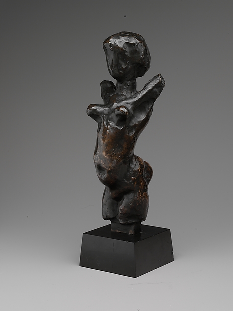
Female Torso, Henri Matisse
African Art tends to replicate human’s physical features and adds a touch of perfection to it. I did not consider this technique prominent in modern art until I saw how paintings from notable artists, such as Picasso, were juxtaposed to African Art. Recognizing the resemblance of the composition of African Art in one of Picasso’s painting made me realize how African Art had already left an impact on famous pieces. Cubism, a style of art that Picasso used, has many features that can relate to African art. Although they tend to be abstract, the geometric composition allows for a unique balance in each piece.
Walking around in the Matisse Exhibition was a different experience in that it focused on the contrasts between his artworks. Throughout the room, there are often two to three pieces that Matisse created with the same subject. Although the setting and objects are alike, each piece emphasizes on different elements of art. Through his pieces, he portrays various perspectives of the same setting. In Still Life with Compote and Fruit and Still life with Compote, apples, and Oranges, he manipulates the lighting to showcase a different environment in his paintings. Although alike in many aspects, these two pieces bring two contrasting vibes. One being bright and blissful while the other one is gloomy. Many of Matisse’s other artworks give the audience many perspectives of the same objects.
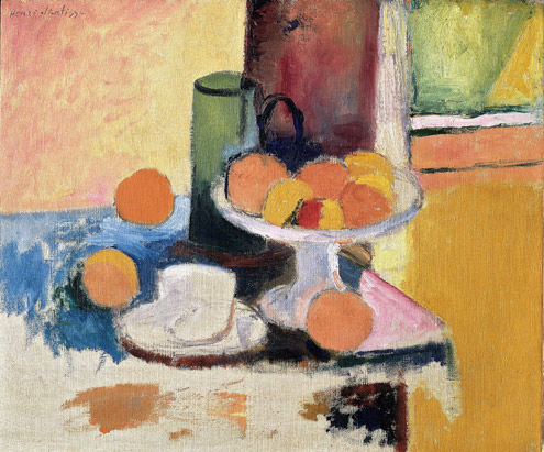
Still Life with Compote and Fruit, Henri Matisse
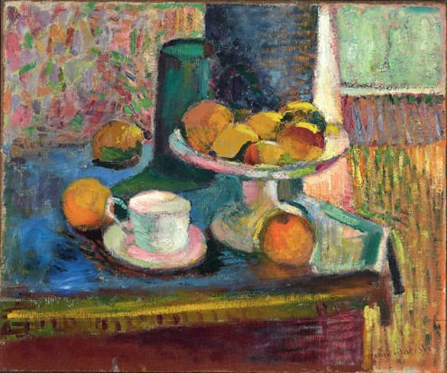
Still Life with Compote, Apples, and Oranges, Henri Matisse
These two exhibits portray how artists have varying perceptions of art. Many well-known artists such as Picasso and Matisse look into African Art for inspiration. However, in their creations, they include their own touch, or in Matisse’s case, multiple versions. In the end, artists have their own style of painting and sculpting that leaves lasting impressions on other artists.
“BAM”
This play truly surprised me, like the acronym of the place it was shown at. When I first entered the BAM Harvey Theater, I could see the disgusted looks on the people’s face as we climbed a steep sketchy staircase to our seats. I was thinking to myself, I hope no one trips and falls on these stairs, because if anyone does the slightest topple, we’d all fall down like dominoes – that would not be good. The walls were peeling; the pipes were rusted. As we arrived to our seats, we were able to see the seats were just as steep. Sitting there waiting for the play to start made me tense that I might fall over and land on the stage. It didn’t seem like the play would be good, I thought.
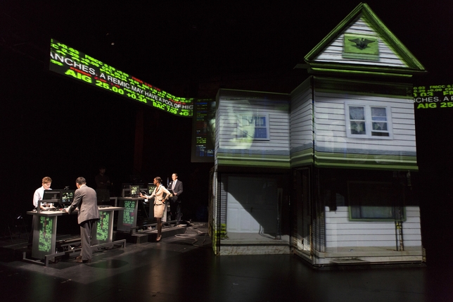
But then, BAM! The lights dimmed, and the production amazed me. Combining technology and ordinary theatrical props, it created an interesting appeal to the play. There were various projectors shining not just light but screens of the stock market running across the top of the stage. A house stands at the middle of the stage and light played a really nice role – it manipulated whether or not the audience could see the people clearly or just their silhouette. At the end of the play, the house surprisingly transforms into a table, with the character, Mr. Alan Greenspan. the chairman of the Federal Reserve at the time, sitting at one end answering to questions of an interview.
The context of the House/Divided was just as interesting. It combined the struggles of those in the times of the Dust Bowl, and the struggles of the mortgage crisis. Throughout the play, there were occasional clips explaining in layman’s terms what was going on. This production made the two economic crises more interesting to learn about and understand.
Many actors played multiple roles. They alternated between the scenes at the stock exchange and the house falling apart. Their enthusiasm was clearly shown on their faces as they ran back and forth onstage and backstage – which was a clear sight for those like us who were sitting up really high. Several screens zoomed into the actors face live. It made the audience really feel a part of the play.
What happened after the play ended at the ‘Talk backs” should not be left out. Surprisingly, someone had the wits to stand up and say “You blew it.” She continued to destroy the performance and create havoc and confusion. In response, the director angrily replied, “you go write your own play.” It concluded the play in a more interesting way, and I had thought I was the only one with the doubts on the play.

Our Current Writer-in-Residence
Not too long ago, Katherine Vaz read to our class and many other her newest work, Below the Salt. After reading Our Lady of the Artichokes, a collection of short stories, one of her other books, it was interesting to see how her writing techniques and thought process could carry on throughout her work. In both stories, she showed the struggles of families and how they survived them.

She explained to us, “I wrote for about a year, stuff that was so terrible that I threw it in a box.” It was almost nice to know that a top-notch author could encounter writer’s block, like the way I’m sure many of us do too.
Vaz continues to read to us an excerpt of her latest work. It uses a lot of detailed words describing a man named John imprisoned with his mother in the 19th century. Feeling trapped and despair, they look to music and each other for inspiration and happiness. John is soon sent to fight in the Civil War. Vaz conducted extensive research to get the facts right and add her emotions of sympathy toward the ones who fought in that war. Through a well descriptive narrative of a man Vaz created, she was able to portray her sentiments on the war. Vaz explains, “the story just came to me.” She knew she had to write something about them, all the struggles and emotions families of that time faced. Her brilliant work did just the thing.

Paying a visit to the Metropolitan Museum
It was gratifying to revisit the Metropolitan Museum of Art, where I used to go often for an intensive drawing class shadowing Van Gogh’s art. However, it wasn’t to see that, I had a class field trip to see the African Art Exhibit and the Matisse Exhibit.
What shocked me the most after paying a visit to these two areas in the MET was that they were actually linked. African Art usually consisted of sculptures and carvings in portrayal of the human body. Multiple masks are lined up on display. Each similarly carved yet so different and unique at the same time.
It wasn’t so clear to me that African artworks are associated to the artworks by Picasso and Matisse, until I was told the Cubism movement looked back to African pieces in inspiration. Then I was able to see how the two vastly different time periods were in fact really alike.
The sculptures in African art often are created in geometric shapes and have most 90-degree angles. The abstractness in the sculptures also appeared very alike to Picasso’s famous creations.

It was an entirely different experience at the Matisse Exhibition. It wasn’t about comparing the similarities between the arts of two artists. Matisse actually created artworks in pairs – two differently composed paintings of the same subject. Matisse wanted to learn what technique better fits him. He portrays various perspectives by manipulating the same setting.
As one can observe the clear differences between the techniques used in creating an image of the subject, Matisse showed how either method and many more can recreate a scene in a beautiful manner.
The Rise and Fall of Apartheid
For those who have read my previous reviews/posts, it’s quite apparent that I appreciate chronology in any work. It adds a realistic storyline that keeps the piece coherent as well as interesting. It’s easier to follow a story than a collage and more meaningful than a single work or piece of art. International Center of Photography’s Rise and Fall of Apartheid exhibit used a chronological technique to tell the story of Apartheid in South Africa and used the chronology to manipulate the audience’s emotions.
When I entered the photography exhibit, I picked up on a few things instantly. First was the order in which the works were set up. Unlike museums or art galleries, the International Center of Photography wanted the audience to start and end in specific destinations, making the entrance to the actual exhibit very small. Other galleries will keep the layout open so that people have agency and the freedom to walk around on their own desire. Here, the work was essentially dictating the method of interpreting the work, which in my opinion made the experience that much better.
To continue, the entrance leads to the first section of a series of works. Here is where the viewer is supposed to gather background information and an idea of what life was like before the conflict surfaced. There is a poster hanging on the first wall with a list of significant dates and what major events occurred at the time. A old movie plays constantly on a small screen, incorrectly depicting the natives of South Africa as animals and cruelly poking fun at them. The section showed the foundation of the tension between two groups, as well as how their lives were separately. The natives lived peacefully, with pride in their background, while the whites preferred to stay apart from the blacks.
The work moves on to show an era of mixture and prosperity. We see minor occurrences of the two races coming together and working together. This all takes place during a period of economic progression in South Africa, a plausible reason as to why the people didn’t object as much to the races mixing. As the work makes a turn, we see the emergence of the arts and the value of creative thinking in South African society. What came across as striking was the presence of numerous native figures in these new arts.
However, the work also created an abrupt entrance into the section covering the prevalence of violence in society. The photographs often involve a strong inclusion of blood and gore to evoke a sense of empathy from the eyes of the audience. They want those looking at the photographs to understand the pain the natives were going through during Apartheid.
The second, lower level took a very different approach as compared to the first. I found that because it served numerous purposes, it let go of the concept of chronology and allowed people to walk freely.
Overall, the exhibit at the International Center of Photography was a great experience which really helped me understand and experience the events that surrounded Apartheid in South Africa.

Credits to www.icp.org
The Power of Influence in Two Met Exhibits
African Art, New York, and The Avant-Garde
“My little brother could sculpt something better” says a Met visitor, after their first time seeing African art in person. It is a common misconception to think that African art is primitive. However, the use of over-exaggerated proportions and geometric shapes that deviate from the organic curves found in nature and in the body are characteristic of a sophisticated style. Modern art forms, such as cubism and expressionism, have emerged, drawing from these elements which are particularly found in African sculpture from Kota, Igbo and Fang artists. The exhibit featured in the Metropolitan Museum of Art, entitled African Art, New York and the Avant-Garde, intends to demonstrate just that.
 The exhibit, a condensed space displaying mostly sculptures, is predominantly African art. Next to many of the African pieces (or somewhere in the vicinity), there is a Modern Art piece and descriptions to highlight the similarities, but the modern works selected did not contain enough visual evidence to demonstrate the influence. The description cards for most pieces described how theparticular piece was a muse for late 19th and 20th century art, but there was too much “tell” and not enough “show.” Visual examples, like cubism pieces, would have conveyed this theme in a more coherent—and interesting—manner.
Although the exhibit lacked a strong theme, the individual pieces were quite beautiful and their descriptions offered an insight into their respective cultures. A mask piece captures a sophistication in its composition: bulbous oval eyes, a wide triangular nose and curvaceous lips carved out of wood are typical of the geometric style that was often embraced by this culture. The mask adjacent to it has contrasting proportions: a narrowjaw line, two slits for eyes, a skinny cylindrical nose and a mouth in the shape of a small “o”. The masks somewhat resemble caricatures, and are mostly made of wood. What is especially fascinating is the fact that the different regions produce their own unique portrayals of facial features, yet the theme of the geometric style can be identified in probably all African masks. One piece, entitled Mask (Kpeliye’e), which according to the description, is a “delicate, feminine representation that honors deceased Senufo elders,” has an array of textures created by etched lines. Environmental influence is present, especially in the goat horns on its head and the small, exposed teeth.
Matisse: In Search of True Painting
The Metropolitan Museum of Art features another exhibit emphasizing style: the well-known fauvism painter, Henri Matisse struggles to find his artistic voice. This space is significantly larger than the African Art space, and palpably more crowded. It is plain to see why: the comparisons here are much more successful in threading together a common theme because it shows several versions of the same painting side by side. This exhibit was much more interesting and enlightening because it shows his process; each version, although portraying the same subject, demonstrates how different styles create such varied experiences.
metmuseum.org
metmuseum.org
A wall on the right upon entering displays a panoply of four small paintings, all of a bowl of fruit. On the far left, Matisse dips into pointillism, a painting style that is achieved by marking thousands of small colored dots of paint on the page. Darker, condensed dots create shadowsandlighter, spaced dots create the illusion of highlights. The dots form together to create the bigger picture. Another bowl of fruit painting in the series is an experimentation with impressionism, as he uses thick blotches of paint to bring out the strokes and variety of color. Entitled Still Life With Compote, Apples and oranges (1899), this piece was painted with bright, saturated colors and many vibrant strokes full of motion. Although oil paints were used, the consistency makes it look as if it were drawn with oil pastels. The lines seem to move in all different directions, giving it a sense of urgency or chaos. This tone is strikingly different from the piece next to it, again of the same subject. It is unfinished: Matisse leaves a part of the canvas naked, with exposed pencil markings. Other works in the exhibit follow this practice of ‘unfinished canvas,’ which offers yet another look into the artist’s process and decision to keep moving on to create new works, and not going back to finish the others. Because Matisse has embraced so many different styles, he was accused of ‘copying’ his counterparts like Van Gogh and Monet. He was inspired by these artists as well as Cezanne,

metmuseum.org

metmuseum.org
Young Sailor I and Young Sailor II are two versions of the same subject, and again, are quite different. While the latter resembles a pop art style with ‘paper cut-out’ bright blocks of color, the former is a painterly piece with heavy outlines, a sense of depth and a more diverse palette. Interestingly enough, both the body language and facial expressions differ in each version: the former features a young man in deep thought, with relaxed limbs and an air of confidence. An up-tight pose, bright eyes and a simple palette are qualities of the other version. The pencil markings make quite a presence in Young Sailor I, underneath a thin layer of paint with some spots of bare canvas. Both pieces were made in 1906. Young Sailor II has slight indications that Matisse might have been inspired by the African Masks: The boys face is not proportional, but instead characterized by geometric facial features and is painted in a way that creates a directional line texture, which is found in a lot of the masks.
Why is the exhibit called In Search of True Painitng? The exhibit does a flawless job in displaying that this artist had a desire to document the stages of his work and try on different methods. In other words, he constantly compared his works to see if he advanced or regressed. He left pieces unfinished because he intended to use them as a reference point. The entire exhibit maps out his quest to find his visual personality as an artist through the process, not the product.
Influence and Experimentation
The two exhibits we explored in the Metropolitan Museum of Art were the “African Influences in Modern Art” and “Matisse: In Search of True Painitng”. Each exhibit was interesting in that the African one was small, but provided a plethora of details to analyze in each influenced work, while the Matisse exhibit could be seen as a progression of his life and working techniques.
The “African Influences in Modern Art” exhibit blended modernism with historical technique, which was probably what artists influenced by African art were striving for. One piece in particular that drew my attention was a wood carving of a mask (unknown artist). The many features of this mask allow it to be seen as a modern interpretation of ancient African art. Most ancient African masks were focused on specific portions of the face, and it can be seen in this one that the nose and lips are much larger than those of an average person, and the forehead comes down good amount more. The wood finishing is also a prime example of influence from African masks, with smoothness in certain areas and a grained texture on the sides. This piece is clearly a modern artist’s interpretation of older works of art.
Another piece that caught my attention was Diego Rivera’s “The Café Terrace”. This oil on canvas piece was clearly influenced by African abstract art. The various colors long with sharp but unrecognizable shapes attest to this. Moreover, the color gradients and choices are also reminiscent of Africa works. One can distinguish certain figures, such as a spoon, the bottom of a table, and a woman’s dress, but the rest is open to interpretation, just like older abstract works. Other modern artists such as Picasso were also influenced by these techniques, color schemes, and textures. Rivera’s work, according to the description adjacent to the work, was at one point placed alongside three African works that were woodcarvings. One can see, through the sharp lines and the fact that some aspects are more prominent that there is a certain amount of influence on Rivera’s work.
While Henri Matisse was influenced by African art during a period of his life, he viewed art as a progression and experiment. He would test different effects and then place them side-by-side in order to compare them. It is almost like writing in the sense that there were many rough drafts before the final piece was accepted. Matisse also liked to paint in pairs and trios in order to gauge how different focuses and techniques could alter the perception of a work. One example of this would be his painting of fruit pairs. He changed the colors around, making different parts of the painting brighter, in order to test how that alters the focus of the work. Even though the fruits were the main focus in the first one, as he made the parts around the fruit brighter and higher definition, the perception of the picture changed. Instead of viewing the work from the fruits out, one would see it from the surroundings in. I found this to be fascinating. He also used a similar technique in a trio: “Gulf of St Tropez “Luxe”, “Calme”, and “Et Volupte.” Each painting reflected a different mood, and he conveyed this by creating different textures. Some were smooth strokes, while others were made whole by combining many short strokes (almost presenting a Van Gogh like effect). Each painting, though having the same subject matter, completely changed meaning because of the technique used in it.
Matisse was also able to show progression through color and definition. In his works “Le Luxe” (1, 2, and 3), he depicts three nude women standing on what seems to be a field. However, as one views each picture, they progressively become sharper. The lines become straighter, and each object in the background can be seen more clearly. However, the one concept that does not escape the eyes is that he takes away color as well. So we go from colored and blurry to sharp and black and white. He almost progresses backwards in order to get to the most basic version of picture, as if to un-cloud the judgment of a viewer, and convey the work as it was supposed to be.
African art has influenced many prominent artists, such as Matisse and Picasso. The sharp lines, bright colors, and abstract shapes are all derived from an ancient culture, modernized by interpretation. People continue to be intrigued by the message African art conveys, and artists have done their best to recreate that sense of inquisitiveness. Matisse was also, through his progressive work, able to incorporate many of these techniques.
Matisse and Africa’s influences provide exhibits worth viewing again and again.

Painting Credit: Diego Rivera
Courtesy of MET
The Apartheid Told in Pictures
The International Center of Photography wasn’t the first place we experienced the Apartheid, which is a time of inequality, cruelty, and violence in South Africa. Photographers who were around at the time, such as Peter Magubane, Leon Levson, Kevin Carter, and Ken Oosterbroek put themselves at risk and in the end, their work, including videos, photos, and audios, all filled the space in the exhibit. Both floors of the museum showed the transition from the early 20th century to modern day culture and politics in South Africa.
After the ticket check, the first thing I noticed was the small entrance and the way the hallway led into another. I was told that the museum was laid out in a particular way to lead the audience in a specific path that would show them the beginning of Apartheid and have them follow the events of the tragedy right up to the end. I thought that this was a great technique to keep the viewers understand exactly what was happening, as opposed to having displays and photos in different or random places, which could be confusing. Instead, having the layout of a timeline really helps tell the story of Apartheid and can even put the audience right back into that specific period and give them the perspective of what it was like back then.
Moving past the two videos, there is a countless number of pictures, all arranged in chronological order and themes. One of the themes that caught my attention was the time of new culture and prosperity. Jazz is one of the new cultures that were displayed; there were videos and photos of people dancing and singing to the music. The victims of the Apartheid used this as a way to still have hope for better times to come.
Of course, the Apartheid was not all happy times. There was a section of the exhibit showing the violence during that period such as dead bodies and protests. Protesters were often violently taken care of, including being beaten and attacked, simply for voicing their opinions. These were shown through videos, which made the situation very surreal and gave me a better understanding of what kind of violence existed and the pains that the victims were going through during that time.
The media that were displayed did a good job at portraying exactly what it was like during the Apartheid. However, the little captions that went along with these pictures or videos were hard to understand because they weren’t directly linked to each other. It takes some careful evaluation to be able to see which description goes with what. Otherwise, if they were placed in a way that would be more clear to the audience, it would have been even better.
The exhibit as a whole was very captivating and gave the audience a clear vision of what the Apartheid was like. The use of not only photographs but also videos and clips puts them in the shoes of the victims. As the audience follows the exhibit in the chronological pathway, it can be said that they are reliving in the experiences of the victims of Apartheid.
In Search of Meaningful Themes
The Metropolitan Museum of Art features many exhibits, but our trip focused on the African Art exhibit and the Matisse exhibit called In Search of True Painting. Both exhibits displayed different forms of art and were unique in their own way. Though each exhibition had its ups and downs, both of them managed to provoke deep thought about relating different aspects of art.
The focus of our visit to the African Art exhibit was on one room that linked the African Art to the avant-garde artists of the 20th century. Much of the African art that was on display in that room was very geometric. Faces were distorted and artists had creative license to display figures in any way they wanted. They took this liberty and distorted people – making eyes bigger, extending torsos and shortening legs. Many of the features on the sculptures such as the eyes or the nose could be broken down into geometric shapes, resulting in a very symmetrical image. This style influenced cubism, a style that well-known artists such as Picasso were famous for. Avant-garde artists like Picasso or Matisse were influenced by the geometry and symmetry that many of the African sculptures and masks had. They evolved on this style and made their own successful work.

Although realizing the link between African art and modern art was interesting, the exhibit itself was dull. The room that linked the past and present was too small and I would have liked to see more connections through more pieces of work. Seeing more work by the 20th century avant-garde artists displayed next to the African art would have made it a lot easier to see the connections the exhibit was trying to bring out. I think that would have added to the power of the exhibit.
In Search of True Painting specialized on Matisse and his search for a style. In his early career, he would paint the same still life two or three times using different techniques, looking for the one that fit him best. In his later career, he moved on to painting series such as “The Dream.” It took him nine months to paint the same image numerous times. His still lives like “Yellow Curtain, Anemones and Fruit” were very ordinary, no matter what style he painted in. It was always the same image and didn’t pull me in like art should. One that did interest me however, was “Large Cliff-Eel” and “Large Cliff-Two Rays.” What I found interesting was that although the background was similar, the different animals created a different feel for the painting and I enjoyed the slight change.

A couple selections from Matisse’s series “The Dream”
Wall text said that the African art and its geometry influenced Matisse. But in this exhibit, I could not see influence. Matisse’s paintings were dotted, made by many dots of paint on the page. Other styles involved a very flowing and shadowed style, and his black and white drafts of paintings. None of his work was very geometrical or distorted so I did not see the African influence. However, this was a thought-provoking exhibit because as I walked through, I tried to discover his style. In trying to find a style, he made his own. He created multiple images of the same painting in different styles. It is an art technique that is unique to him, and it works well for the still lives he does. The different styles for still lives attempt to add spice and variance to an otherwise dull subject.
While both exhibits did not fully interest me, I found their themes intriguing. I found the African exhibit to be too small and did not have enough sculptures and paintings to fully bring out the power of the connection between past and present. The Matisse exhibit was boring because his paintings all looked the same. The still lives were the same fruit and vases over and over again. Even the different styles could not capture my attention. But the themes that the exhibits brought out were well constructed. Connecting African art to popular avant-garde creations such as cubism through geometry was an eye-opening theme that I had never thought about before. Seeing Matisse struggle to find a style while making his own was fascinating, especially seeing all the times he repainted something. And while the art was not memorable, the themes will remain strong because of how well they were created.
Under-Appreciated African art and Metaphysical Matisse
I have been many to the Metropolitan Museum many times in my life before. It is an enormous museum with many collections. But I never really zoomed in one aspect of the MET’s many works of art. Because of our IDC class, we got to focus on two: The 100th anniversary of the African Art exhibit and the Matisse display.
I have to say that the African Art show was a disappointment. In our class, Professor Bernstein talked about how important this expo was. It radically changed how artists used to do paintings or other works of art. With such high expectation I walked into the MET museum. What I got instead was a little exhibition space. That has to be the fault of the MET. They are the ones who decide how everything is set up. Such an influential group of works needed a larger venue where people can come and appreciate them without being crammed in like a clown car.
But if you looked at the individual pieces, they were amazing. The woodwork done was amazing. The sculptures were symmetrical and each had its own characteristic to it. For example, “Sculptural Element from a Reliquary Ensemble: Head” looks like a bland piece from the straight. If you were to look at it from the side, you would see a different view. The chin and jaw are elongated. The ears are very circular. I believe that this is the first time modern artists saw that not everything has to be straight and perfect. Shapes and geometry could be used. As a result, many artists incorporated these ideas into their work.

As we went inside the Matisse exhibit, it was a stark contrast. By reading the captions, it showed how Matisse painted everything in pairs or triplets in the beginning in his career. When I first saw this. I thought that he might have Over Compulsive Disorder. But I kept in mind the point of this exhibit: “In Search of True Painting.” It seemed strange at first why the curator called it this.
The first painting that hit me was that of “Le Luxe.” Matisse painted three versions of this masterpiece. Each version was different. Going from left to right, you can see that there is an inverse relationship between color and definition. The clearest picture was that done by pencil.
After a while, it seemed that Matisse didn’t like to keep painting the same image. This was the case with “Apples”. This pair was completely different from each other. First, the background in one was green. It provides a sort of cool color. The other painting had a powerful red background. It represents a hot color. The angles at which the two were painted are different. In the former, you see the legs of the chair. While in the latter, there are no legs. It indicates a different point of view

http://www.oilpainting-frame.com/upload1/file-admin/images/new8/Henri%20Matisse-352563.jpg
Honestly, I believe the theme of the exhibit represents an idea that is metaphysical. How can one person judge which is the “true” or not? By giving such an idea, the curator was trying to express that there is no such thing. Matisse it seems realized this after a while and that is why he paints the pairs and triplets of the same work. Maybe out of one of them, it would really speak to us.
Or on a more cynical note, maybe it was good marketing plan by the museum to get people to go all the way to the end and then to be hit with the gift shop.
BAM- House Divided
As a person who’s only been to Brooklyn about 10 times in his life, I was hesitant to go for a play I hadn’t ever heard of before hand. I was familiar with the BAM theatre and had heard about it, but still didn’t want to go. Thank god I did. This play did a great job of reviving my interest in theatre and in my opinion, spoke more to us as business students.
Marianne Weems’s House/Divided focuses on two of the most devastating financial times this country has ever faced. However, instead of merely telling a story of the two or using them as mere settings, Weems juxtaposes the two in a great play highlighting the emotional toll these economic meltdowns have had. The plot compared how essentially heartless corporate businessmen would make millions trading on mortgages until the entire system comes crashing. Instead of putting the light on how the companies were affected, Weems directed her attention to how the homeowners were hurt. She wanted the audience to catch light of how foreclosures force a sense of detachment from one’s roots. These homes were where families have prospered for generations and Weems appeals to her audiences pathos by pulling them away. She pushes the envelope even further by portraying life after foreclosure, where families are forced to beg for food.
The set was something I hadn’t seen before and was very innovative. Instead of distracting the audience by constantly changing the house set up, the production played with lighting and used versatile equipment to allow the show to run smoothly. The setting would go from the 1930’s to the 2000’s without catching the attention of the audience. Weems had an interesting technique of zooming up on a specific characters face during specific scenes. I found that it was a way to increase the impact of sorrow or anger towards the character in the spotlight.
In all honesty, I didn’t find anything special to focus on the costume design. I found that it served it’s purpose of portraying bankers as bankers, farmers as farmers, etc. However, the audio manipulation was very successful. In the depression-era scenes, the stringent archaic tone stressed the attitude in focus and brought to light the grim atmosphere. In the more modern, recession-era the sound helped characterize the bankers as individuals JUST looking to show a profit on their bottom line.

Credits to NYTimes
The play was a great experience that really spoke to us specifically, since a majority of us are business students. While we all hear of the banking crises, this play did a great job of comparing it to the Great Depression. It took corporate America out of the focus and really stressed the emotional toll on the homeowner.
MET Exhibit: Seeing the Abstract as the Norm
The Metropolitan Museum of Art boasts some of the greatest art exhibits in New York City. The museum’s vast size and structure makes it virtually impossible to see all of the exhibits in one day. Just last Thursday, I went to the museum to see two particular exhibits: African Art and Matisse: In Search of True Painting. While very different from each other, both of these exhibits proved to be rather compelling.
While exploring the African Art exhibit, one piece of art immediately grabbed my attention. I could not exactly decipher what the artist was trying to portray in his sketch, so it made me curiously stop and read the description. The piece of art, known as “Seated Man Reading a Newspaper” was painted by the great European artist, Pablo Picasso. It turns out that Picasso was influenced heavily by African Art and looked for ways to incorporate it into his style of European Art. What struck me most about this work was the abstract nature of it. The various geometric shapes and shadings give each viewer the ability to interpret it differently from the next. But more importantly, it shows the significant impact that African Art had on many big name artists, like Picasso.

Seated Man Reading a Newspaper
At the time it was introduced, Negro Art was revolutionary. It went against all the conventional methods of trying to depict everything according to scale. The “Seated Man Holding a Vessel,” created by an unknown artist, epitomizes the idiosyncratic nature of this genre of art. I really enjoyed this sculpture because of its unconventional features: from the large forehead, to the chinless head, all the way down to the narrow torso. At times, part of being human is viewing things from radically different perspectives. By stepping outside of the norms (in this case European Art), we can ultimately appreciate the peculiar things of life, such as this early, 20th century wooden sculpture.

Seated Male Holding Vessel
After spending some time in the African Art exhibit, I moved onto Matisse: In Search of True Painting. What I found interesting about Matisse is that he has an image in mind and recreates it over and over using a plethora of techniques. Instead of calling the original works “drafts,” he values all of them equally in his quest for “True Painting.” According to the first description on the wall, he valued the journey of reaching his finished product to be just as important as the final painting itself. I think that’s important for him to recognize because we often just seek a destination, rather than the journey that accompanies it.
Although most of his work is done in doubles or triples, there is one particular scene that he recreates 15 times. The scene is a woman with a variety of patterns on her clothing, duplicated until perfection was reached. All 15 copies are hanging along one wall with the final, colored masterpiece in the center. We know that as a painter, Matisse was lost and trying to discover who he truly was. As his career progressed, he created more copies of the same work. Just as many elderly people do, Matisse could have been trying to rekindle the greatness that once burned during the earlier years of his life.

The Dream
Photo Credit: Stan Honda / AFP
Avant-Garde and Matisse
Going to the Metropolitan Museum of Art at night was a very different experience. Compare to the rushing crowds going back and forth in the morning, the soothing atmosphere created by the empty museum was, at least in my opinion, more suitable for art viewing—somehow you are willing to stay longer in front of each piece. So although this might sound weird, I was actually glad that my schedule conflict allowed me to go to the MET on my own. I visited the African Art and Matisse section. Let’s start with the African Art.
There was a section named “The Avant Grade”, and the title caught my eyes. I went online
http://images.metmuseum.org/CRDImages/ao/web-thumb/1915-07.jpg
and searched for this term. It was in French. Wikipedia said “it is a French term used in English as a noun or adjective to refer to people or works that are experimental or innovative, particularly with respect to art, culture, and politics”. At the first glance, I didn’t find it different from the rest of the room. How was this supposed to be “innovative”? Then, I realized that it was an art served to provoke others. Picasso was one of these artists that were influenced by these cultural pieces! Then I looked at them again. This time, I could definitely see the similarities.

http://images.metmuseum.org/CRDImages/ma/exhibition-medium/DP219638.jpg
African Arts were known for their abstract figures. The art-form proportion varied from the real life proportion; and the faces of figures were always exaggerated with parts being altered. I had never figured out why African Art developed into such a pattern, but it was obviously very distinctive, especially when compared to European arts at the time, which could be one reason that people resisted this culture. There were a series of names that started with “Seated Man”, two were African pieces and one was a pencil drawing by Picasso.
http://images.metmuseum.org/CRDImages/ao/web-thumb/1914-06_a.jpg
It was easy to notice the identical scale of the head and body, which was not presented in history until then. With the knowledge that Picasso became famous long before his death, this became a marker in history pointing the shift of people’s willingness to accept and include others.
Another exhibit I visited was the Matisse. It gave me a different chill from the Avant-Garde. The sharp contrast between colors and various styles used to interpret the same view were something nowhere to be found in my previous exhibit. The most amazing part of this was perhaps the numerous interpretations of one single view. The doted style told the shift of colors and strengthened the contrast in between; the plain oil style gave a realistic twist to the painting; a warmer series of color created a mood that couldn’t be seen in a colder
color series. All these angles showed that each time Matisse painted a similar image—he gave a new twist to it. Unlike most artists, he allowed the addition of new frames, even if that would ruin his previous visions. Not only did he allow it, he also admired it. He asked a photographer to document his process of creation, in which one could see the transition of the painting. I didn’t know that the same view meant so many different images to different people (or the same person with different interpretation) until Matisse juxtaposed his visions in front of me. Thank you so much, for allowing me to step into your world of imagination and share a piece of your mind.
http://upload.wikimedia.org/wikipedia/en/thumb/0/07/Matisse-Luxe.jpg/300px-Matisse-Luxe.jpg

http://www.thecultureconcept.com/circle/wp-content/uploads/2012/11/3._The-Gulf-of-Saint-Tropez_Henri-Matisse.jpg
A Great Puzzle
The constant switch between the aftermath of The Great Depression and the stock market crash in 2008 drove a perfectly formulated play into a great mess. Marianne Weems directed House/Divided, a play performed at the Brooklyn Academy of Music. By juxtaposing the two eras, she wanted to portray the similarities between the struggles of the time. Theoretically, the techniques she used to compare the two satisfied her purpose. However, the play was as confusing as simultaneously reading two different books. In the end, this was a puzzle rather than a play.
House/Divided was inspired by John Steinbeck’s The Grapes of Wrath, which is a story that focuses on the economic hardships people faced after the Great Depression in 1929. Weems wanted to incorporate scenes from this fictional story to parallel them with interviews of owners who lost their homes to banks. These two stories were projected onto a house on center stage and a white background. Throughout the play, actors shifted parts of the structure to serve other purposes. To me, it was a symbol of the fragile economy. If the shifting of pieces can transform a house and serve another purpose, then what is going to stop investment banks from manipulating stock prices to earn money?
The sound effects and lighting played a crucial role throughout the performance. Without them, I would not have understood when Weems was shifting from one scene to another. Each transition came as a surprise, which made it difficult to grasp when each vignette ended. The use of technology to transform the scene from one setting to another only served as a reminder of the stark differences between the two eras, rather than the similarities. Although the man reeling the projected tape gave off an antiquated vibe, the components of the house that made it so versatile also appeared as too advanced for its time.
Aside from the non-traditional way of telling these two stories, the puzzles were easier to put together when there was dialogue. The actors were full of realistic emotions; there were humorous jokes when stock prices were all increasing, and looked distressed when the market crashed. Simultaneously, the Joad family spoke with an Ohio accent, where the family is from. Understanding the parallelism between the interviews and Joads’ moving was the easiest part of this big puzzle because both stock market crashes had left similar impacts on many families. As the Joad family travelled across barren land, other families many years later are facing foreclosure issues.
The structure suddenly collapsed to serve as a table at the end of the play. An actor playing Alan Greenspan was being interviewed at this table/house. This was the final piece of this difficult puzzle. Greenspan was questioned about deregulation and his approaches at dealing with the current economy. The collapse of the house signifies how one man can lead to the destruction of families and homes. In the end, Weems was able to retell these two stories from different eras, but these vignettes were difficult to string together to form the final puzzle. This confusion portrays the inner emotions of people who struggled to survive after these two stock market crashes. From being confused to seemingly understanding the situation and back to confusion, these thoughts represent how people during these eras strived to survive the aftermath of the difficult conditions.
House/divided- credits to: cdn-media.backstage.com
Art From Around The Globe
This past trip to the Metropolitan Museum of Art went better than I expected. Something happened that I wasn’t sure would happen; I was interested.
We began our journey into the African Art exhibit. It was amazing abstract art in the exhibit. Apparently African art was unknown to many artists until an exhibit was showcased in the early 1900’s. Then the interest in African Art exploded. In African Art, people aren’t always people. Sometimes they are spoon-like figures. Sometimes they are deformed. Sometimes they are creepy. In my opinion, the creepy ones were the best. Now after the exhibit in the early 1900’s, African abstract art began to influence more modern artists like the famous Pablo Picasso.
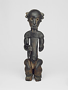
I had two favorite pieces from the African exhibit. The first was this piece.

Unidentified Fang artist (Betsi group); Lower Ogooué River Valley, Gabon, Sculptural Element from a Reliquary Ensemble: Head, before 1915, Wood, brass, resin, oil, H. 27 cm, Philadelphia Museum of Art, The Louise and Walter Arensberg Collection, 1950 (1950-134-202), © Philadelphia Museum of Art.
Honestly, it’s pretty scary and I like it. The wide jaw and hairline lead me to believe that it is of a man. Now onto the creepy parts. The eyes are big, glossy, and black. They give off a sense of being spaced out. I am not exactly sure. The forehead is large but the part that stands out the most is the jaw. The teeth are thin, long, and spaced out. The lips are pursed, almost as to kiss someone/something. Then the neck is thin and long, disproportionate to the rest of the head. And that’s another thing, the piece is just a head. Maybe the eyes have the spaced out look because the person is dead. Maybe there are no pupils because then it would look too alive. It is very interesting and like I said before, it freaks me out; which is awesome.
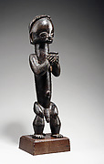
The second piece that I found interesting and creepy was this one.

This one is called the Maiden Mask. I would assume from the word ‘maiden,’ it is a woman’s mask. Supposedly, these masks were used in some kind of African performances. Which would lead me to believe that people would put this on their faces, which is obvious because of the word ‘mask.’ It is a cool piece, and the elongated face, small beady eyes, sharp teeth, and big mask freak me out. I like this one the best.
After the African exhibit, we visited the Matisse—In Search of True Painting. Matisse also had abstract tendencies, but they did not seem to have African influence. However, if we say that all ‘modern’ art can trace it’s roots to African Art, then maybe Matisse was influenced by the Africans.
Matisse had painted doubles and triples of most of his work. He seemed to be in search of the painter that he was. He was just conflicted. He used different styles, colors, and techniques to create different works of art from the same subject. He did a triplet of Notre Dame. They were all similar, but all different. Here is one of the triplets.

During his later life, Matisse delved into more and more attempts at the same work. He went from doubles and triples to painting the same subject around 15 times. So I guess instead of finding himself as an artist, Matisse got more lost in himself. Either that, or his ‘true’ painting was his love to see the same work differently. He was a confusing man.

Apartheid Brought Back To Life.
Apartheid was brought back to life in the form of the ICP exhibit, Rise and Fall of Apartheid: Photography and the Bureaucracy of Everyday Life. But the big question was if it ever died.
Apartheid is the legislated racial segregation of blacks. It used to be specifically referring to the actions taken in South Africa but it can be argued that this behavior is not simply limited to the region of South Africa.
Berenice Abbot would be happy with this exhibit. Each and every picture is a slap in the face. Practically shoving painful and desperate reality down your throat. There is a message in each picture, another part of the exhibit that she would be happy with. What is this message? Well, clearly a theme is that Apartheid is absolutely abominable and should be abolished.
However the concept of Apartheid was so strong that in everything from movies to simple newspapers. It, unfortunately, was becoming the essence of society at that point in history. Something powerful enough to be injected into all aspects of society is not easily forgotten, though. Even after the films stopped being produced and the racist newspapers stopped being printed, there was still a presence of apartheid. At first it was de jure apartheid. Laws were passed segregating the dark skinned from the white skinned. Just as the Jim Crow laws here in America were legally binding measures taken by whites.
After many of the laws were repealed, it became de facto apartheid. A photo by Peter Magubane showed the ‘notorious green car: police drove around Soweto taking potshots at innocent passerby. Imagine that, being shot by your own police. The people who are put there to protect you. Another photo shows Antoinette Sithole and Mbuyisa Makhubo carrying Hector Pieterson at a peaceful student demonstration.
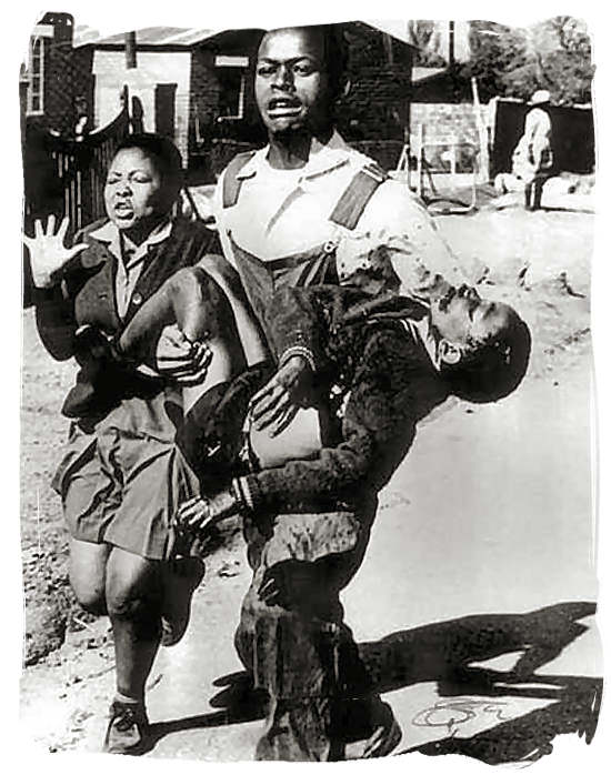
By Sam Nzima
He had been shot by the police as well.
Then there is another photo by Peter Magubane which everyone seems to connect with. It is of 5,000+ people at a graveyard after the Sharpeville Massacre. The massacre was because of a peaceful protest. The protestors apparently outnumbered the amount of police present. So they opened fire, killing almost 7o people.

By Peter Magubane
The whole exhibit is powerful and sends a clear message. It did its job well.
“Fear Turns to Wrath”
Walking into the theater, I didn’t know what the unfinished structure in the middle of the stage was. It looked a little like a house, but surely it wasn’t done yet. Were we too early? Was the stage crew still setting up? Show was starting in 10 minutes, so they better kick it into high gear. Seven minutes were left, still no stage crew. Two minutes, still nobody. Then there was no time left, time to see what was happening. The projectors turned on and the house was instantly complete.

What trickery was this? Well whatever it was, I was instantly interested. (Photos courtesy of BAM)
They say history repeats itself. And I’d say that the producers at BAM would agree. The appropriately named production of House/Divided fused together the past and the present. Taking parts of Steinbeck’s Grapes of Wrath to illustrate their point. What does Steinbeck’s classic and the current financial state have in common? More that you’d think. Let’s take Rosasharn’s baby for example. A stillbirth. Why though? Is it a symbol that new life cannot be supported in these desperate times? If it is then why did House/Divided put it in their play? Are they trying to tell us something?

Back to the set. A symbol in itself. Throughout the play, pieces of the house are broken off and tossed away. Is the house itself a symbol? It must have been important enough to be put in the title. A House/Divided, yes there is a house on set. And it is being divided, but what other house do we know of? Is it in our government, or perhaps the economy itself? The symbolism is everywhere. If the production gets you to think (which it did for me) then it did its job. If the house is the economy itself, then then the play is illustrating its eventual demise. The Grapes of Wrath was a perfect juxtaposition with today. However it was not a juxtaposition of current events, but time itself. Time is one of the only factors that was different. Shown with the folk music, different music and lighting. The struggle, sadness, and sorrow is apparent in both eras.
But who is to blame? At the end of the play, the house topples to a elongated table. At the end of it sits Alan Greenspan (well, an actor playing him.) Mr. Greenspan was the head of the Fed when the current recession began. According to the play, he was a force in the current economic situation. As well as the banking system in general. Have we, as a nation, become too dependent on banks and the government? Is there a need for reform? Do we need to regulate or deregulate? Many questions are raised after viewing the play. And only the individual can answer them because this society will never agree.

History repeats itself unless we learn from it. Will we—as a nation—ever learn?
Bending Reality, Art That Changes Our Perspectives
In the Metropolitan Museum of Art, a plethora of arts from various eras and all over the world can be seen. The first exhibited we visited was a little room section within African Arts. In particular, African art was relatively unknown in the late 1800s. That changed after a showcase of African arts in 1914. Struck by the unique characteristics of African art such as the wooden figures’ abstract representations and distorted shapes, great artistic leaders in American and Europe became enamored by them and eventually incorporated some of the African arts’ styles into their own works.
One of the African arts that seemed to influence modern art was a wooden figure by an unidentified Fang artist (Ntumu group) titled “Figure from a Reliquary Ensemble: Seated Male Holding Vessel.” This wood sculpture was made of wood, brass or copper and was in a seating position holding a bowl-like object. Its shape was peculiar and parts appeared to be distorted. It didn’t have a chin; instead, that area was flat while the lips were carved on the area where the chin would be. The way its eyes were carved, without pupils made it seem like it was staring into empty space. The form of its body was almost abstract in that its neck was the same size, and shape, as its body, making the figure appeared to have an extended body while its legs were relatively short. One other thing that sparked interest to American and European artists might be African art’s open exhibitionism in their sculptures. The figure was naked but that didn’t make it feel out of place.

Seated Male Holding Vessel. Photo credits to the Metropolitan Museum of Art
The abstract and distorted nature of African art was profoundly present in Pablo Picasso’s art titled “Seated Man Reading a Newspaper.” Aside from the title, Picasso’s drawing looked nothing like the sculpture I mentioned above, “Seated Male Holding Vessel.” In fact, it didn’t look like a man sitting and reading a newspaper at all. The drawing was composed of many rectangular shapes and shading where the viewers could somewhat make out a person and perhaps a newspaper as indicated by a large blank rectangular space in the center. That was precisely the point. The Seated Man in Picasso’s work was very abstract; it had its features distorted, indicating a strong resemblance to how African arts were made. Through this, art was no longer rigid and focused on resembling reality. Modern art took on a more abstract perspective, hence, welcoming the possibilities of art in vastly different forms.

Seated Man Reading a Newspaper. Photo credits to the Metropolitan Museum of Art
Moving on from the African Art section while keeping in mind its influences, we arrived at the gallery, Matisse – In Search of True Painting. The paintings in the gallery were placed chronologically. One of the first paintings that caught my eye after I entered the gallery was Henri Matisse’s Still Life with Purro II (1904-5) painting. Shapes of objects such as shapes of bottles, fruits, and towel seemed to have blended in with the background because so many colorful dots were used to color the painting. It was certainly a very abstract way to paint and portray still life. Next to it was a clearer (shapes more visible) version painted in 1904 titled Still Life with Purro I. As the title indicated, Still Life with Purro I was painted before Still Life with Purro II. The first, however, was not as bright and vivid as the second even though it gave form to the objects much better. The impact just wasn’t the same. The first had a darker, gloomier atmosphere while the second was lively and seemed to be full of motion.

Still Life with Purro II (Left), Still Life with Purro I (Right). Photo credits to the Metropolitan Museum of Art.
It wasn’t a surprised then to see the same style used in another painting called Luxe, calme, et volupté (1904). This painting showed seven ladies picnicking near the shore—some were completely exposed. The element of unrestricted nudity seemed to be influenced by African art. Luxe, calme, et volupté was just one of the many.
Walking further, a pattern seemed to emerge from the layout of the gallery. The gallery purposely showed multiple paintings of the same thing but in different styles to indicate Matisse’s “search” for the true form of painting. Towards the end of the exhibit, the painting with the most variations was probably The Dream (1940). Within nine months, Matisse drew and painted over ten images very abstractly with curvy lines and non-solid shapes. He was meticulously trying to figure out what form or style was the ideal one—the true painting. He explored many templates and styles, changing the shape of the person and her hair, curving the table, turning the angle, playing with the position of the person, and varying the designs on the clothing. Through this process, to Matisse, the true painting seemed to be less rigid like reality and freer like abstractions. Matisse’s final product, The Dream, revealed this through the curvy and disproportional arms, and the slanted table that appeared to tilt downwards. Perhaps, like the title of the painting The Dream, the true painting was one that is can bend reality and curve our perspectives so that a new way of viewing the same thing could be found.

The Dream (Left), Reprint of archival photograph documenting Henri Matisse’s process of painting The Dream (Right). Photo credits to the Metropolitan Museum of Art.
A picture is worth a thousand words
The carefully selected and curated photographs in the exhibit of Rise and Fall of Apartheid: Photography and the Bureaucracy of Everyday Life at the International Center of Photography (ICP) show the remnants and everlasting struggles of apartheid, the segregation in South Africa more than sixty years ago. Curated by Okwui Enwezor and Rory Bester, the exhibition proposes the power of the photography and journalism, and honors the exceptional achievement of South African journalists and photographers.
The exhibition examines the apartheid system and how it affected every aspect of South Africa. Through photographs, films, books, magazines, and newspapers, the exhibit showed how apartheid interfered with all of social aspects, ranging from housing, public amenities, and transportation to education, social events, tourism, religion and businesses. A big part of South African history is documented and on display right here in the center of the Big Apple at ICP.
There were photographs of people living behind gates and barbed wires. It shows how much resemblance there is between that and a prison. Alcan aluminum window frames were also on display in the lower level of the museum to represent the business aspect in South Africa. There plentiful portraits of important figures, such as Nelson Mandela. One particularly famous one is the one with Nelson Mandela dressed in traditional beads and a bed spread, as he was hiding out from the police during his period as the “black pimpernel” in 1961. There were also numerous accounts of protests – crowds of people with the same idea holding up posters and signs expressing their powerful thoughts of justice.
Out of the hundreds of media presented at the museum, two really stood out to me. I apologize ahead of time for the lack of the photographs I am about to describe, because the museum did not allow photos to be taken of the exhibit.
One was a photograph of a police interference with innocent villagers even after such incident. The photograph’s caption was: “After a funeral of a three-year old child shot in the head by a policeman’s rubber bullet, angry mourners clash with police near the family’s home.” It’s troubling to hear about such misery apartheid could bring to an innocent family, and many other families across South Africa as well.
My second photograph was a picture capturing African Americans in a fashion show and having a party. This picture, I thought, not only shows happiness, but strength in the people of South Africa. The strength they held within them throughout the period of apartheid. Without that strength, they would not been able to endure the hardships and put an end to apartheid.
A picture is worth a thousand words.
Imagine 500 pictures. How powerful is that?

The Rise and Fall of Apartheid Review
A profound and explicit exhibition at the International Center of Photography, Rise and Fall of Apartheid holds a magnifying glass up to the Apartheid, offering a multi-faceted view of South Africa in a span of 60+ years.Not only does it present the confrontational horrors of racial segregation and its tangible effects, but the collection of magazines, books, documentary clips, uncensored video, commercials and many other mediums present the every day life that adds up to form a culture. The photos and media are strung together to form a powerful narrative, classified into segments of a common theme. Two themes, the political and emotional response, and blacks in the media offered a bi-lateral perspective into Apartheid.
One talented photojournalist, Peter Magubane, set the scene for the political and emotional responses to segregation in South Africa, especially in the Soweto Uprising. The uprising was sparked by black students in 1976 in attempt to change the unjust, highly segregated school system. Magubane’s photographs blur the line between aesthetic and documentary, while effectively conjuring feelings of pathos from viewers. He especially captures the chilling aftermath of the uprising with an image of a black person’s corpse covered by newspapers, with a desolate open palm in the foreground. The newspaper ironically reads “This, I believe, as a South African.” According to the description beside the photograph, dead bodies covered with newspaper filled the streets during the Soweto Riots in 1976. Another image by the same artist, depicting the funeral of Hector Pieterson, who was the first young victim of the Soweto Uprising, poignantly captures this family’s struggle by highlighting body language. Four individuals, side by sidestand behind the casket with raised right fists and bowed heads.

The Treason Trial, beginning in 1956 until 1961 was yet another tumultuous event of Apartheid; 156 people, including Nelson Mandela were arrested in a raid and accused of Treason. Photographs taken by Eli Weinberg and an unidentified photographer lay out a narrative that demonstrates the sociology of power, the strength of the force that results when the people band together to ignite change. Weinberg’s Crowd Near the Drill Hall on the opening day of the Treason Trial illustrates a historic moment by documenting the facial expressions of the subjects, the unity of the signs they are holding up, and how the entire frame is occupied by the crowd. Another powerful Weinberg photograph is featured in the exhibit, which shows a young Nelson Mandela in 1961 clad in traditional beads and a bedspread, hiding from the police. The subject’s expression is one of sincere dedication and nobility; the photographer captures his presence as a leader. Surrounding photographs are arranged chronologically, with a heavy emphasison crowds for this particular event. A photograph by an unnamed photographer shows an anxious, somber crowd behind a foreground of three white policemen. The crowd, which is mostly black with some whites, seem to be staring in unison in the same direction, at a distant spot behind the camera.
 A German-born South African, Jurgen Schadeberg, takes a particular interest in the Black Sash, an anti-apartheid women’s group. In contrast to images of fiery crowds of the Soweto Uprising and the Treason Trial, adjacent images of the Black Sash appear to be funeral-like. Schadeberg captures grave faces, bowed heads and women holding a candle to their chests. This juxtaposition of images shows the stark differences of how certain crowds conduct protests. The women in his images wear black sashes and stand still in the frame like mannequins, frozen in time, as they passively hold up signs. The photographer makes a point in his photographs that this was a global cause, contributing to the exhibit’s theme of the sociological influence. An interesting choice that was made in curating the exhibit was to showcase the group rather than the individual. A crowd of women of the 29 ANC Women’s League are shown being arrested for breaking a law that prohibited them from entering township.
The exhibit cleverly weaves in an environment of the culture and everyday life that took place, despite the horror of the Apartheid. A long panoply of Drum Magazine covers lie in a glass showcase, a contrasting sight against the chilling images on the opposite end of the room. Drum Magazine is targeted to mainly black readers and contains market news, entertainment, and feature articles. Peter Magubane, who worked for the magazine, says, “Drum was a different home; it did not have apartheid. There was no discrimination in the offices of Drum magazine. It was only when you left Drum and entered the world outside of the main door that you knew you were in apartheid land. But while you were inside Drum magazine, everyone there was a family.” The brightly-colored covers featuring smiling black women seemed to belong to a different place and time period. In the next room, photographs of rebellious women in South Africa’s “jazz age” hung on the walls. The unnamed photographers captured photos of women with bare breasts, surrounded by men. This time period during the Apartheid showed women establishing a presence on the stage: some sang, others danced, and a few engaged in promiscuous acts. While Schadeberg’s images displayed a culture of reserved, noble women, this section of the exhibit portrayed women as objects of pleasure, entertainers.
Newspaper articles, drawings, journal pages, picture books, and other primary sources are on display in the exhibit, giving a 360 degree view of Apartheid. Posters, advertisements and guerilla marketing also make a presence, highlighting the business trends of the time. The International Center of Photography designed a show that exceeds photojournalism; it creates a highly realistic atmosphere that has the ability to bring viewers back to this historical time.
Rise and Fall of Apartheid at the International Center of Photography will be open for viewing until January 6, 2013.
Apartheid: Gone, but Still Here
When something is outlawed, it does not fully erase the impact that it once had in society. Many people tried to destroy Apartheid again and again, but the legislation did not come down until the 1990’s. Even though it has been uprooted from South Africa, the remains of it still exist today. In the International Center of Photography, better known as ICP, there are a plethora of images that still capture the troubling atmosphere that surrounded Apartheid. Within ICP, some of the photographs are much more graphic, and consequently moving, than others. To me, there were three photos that left an impressionable mark on my understanding of Apartheid.
Peter Magubane, a well-known combatant of Apartheid, captures perhaps two of the most frightening images in the exhibit. The first snapshot was taken during 1960. It features what seems to be a never-ending line of coffins for all of the African Americans who died during a riot. On both sides of the caskets are families and friends mourning the deaths of their loved ones. In the description of the picture, it is said that there were more than 5,000 people at the graveyard that day. When the South African government learned that Magubane was taking pictures of such tragic events, they did not want these photos published. Even though there is no immediate violence depicted in this picture, a feeling of heartache can be sensed by the facial expressions of those present at the cemetery.

Never Ending Row of Caskets
Photo Credit: Peter Magubane
After being arrested for his striking photography, Magubane returned in the 1970’s to capture the tragedy of the Soweto Uprising. During one of these riots, he may have taken the most disturbing snapshot of his long career. In the photo, there is a man holding a rather young child, placing him into the back seat of a vehicle. The famous Apartheid photographer captured an image of a child shot dead and now being situated the back of a car. Anyone who stood in the way of law enforcement was ultimately shot dead. This shows the severity of the situation because they did not discriminate who they killed, not even small children.
Still, there were others who revealed the true brutality of Apartheid through their photography. In 1959, Gideon Mendel photographs a struggle between a family and the police in action. In this image, the policemen possess a variety of weapons, whereas the family has nothing to defend themselves. This parallels the idea that despite the large numbers of people against Apartheid, they could not make much of an impact because they were basically powerless. After taking a closer look, I saw that there was a child lying dead on the ground after being shot with a bullet. Just like Magubane, Mendel vividly captures the ruthlessness towards children in South Africa during the time.
The Rise and Fall of Apartheid exhibit at ICP contains some of the most power photographs of the 20th century. They show the harsh reality that many African American families experienced during that time. Magubane and Mendel both gained wide spread recognition with their photographs of the cruelty unleashed on children. Even though Apartheid no longer legally exists, its impact will live forever through these photographs.

The Rise and Fall of Apartheid Exhibit at ICP
Photo Credit: DLK.Blogspot.com
Separate, Yet United
Apartheid was a era of racial segregation that existed in South Africa. With the power of photography, this harsh system came to an end in 1990s.
Walking into the International Center of Photography (ICP), I witnessed for the first time the consequences of Apartheid. Walking down the row of photos was like travelling back and forward through time. In the timeline of photographs, earlier photographers captured the most brutal part of the segregation, whereas newer photographers captured the changing culture that was a result of Apartheid. From public protests to speeches, South Africans openly protested against the cruel laws that the government imposed. This exhibition thoroughly portrays the progress of the movement with a variety of photographs from different owners. Through this variety, ICP offered a wide range of perspectives of the same movement.
One photo that stood out to me was Nanny and Child taken by Peter Magubane in 1950s. What stood out to me the most were words on the chair: Europeans Only. These simple, yet powerful, words on the chair are able to keep one race away from another. In this photo, the African nanny is looking over the white little girl. Automatically placed in a lower social class because of her race, the African nanny is forced to sit on the other side of the bench. The little girl on her face also has a confused expression on her face. This photo portrays how children were trained at a young age to understand the laws of Apartheid. Even though she seems confused, she knows to sit on her designated side. This photo revealed how Apartheid segregated the two races, no matter their age.

However, in another photo, a photographer offered a different perspective. In the photo The Black Sash, an anti-apartheid women’s group, also taken in the 1950s, is a portrayal of unison within segregation. Jurgen Schadeberg’s photo reveals how women from various races assembled to fight this movement. In this image, a large group of both colored and white women stood together in front of the Parliament and government offices holding a burning candle and wearing a black sash. This was a symbol of unity between races—one that the government had fought hard to separate.

By placing Schadeberg’s photo across from Magubane’s, ICP has effectively separated the two impacts that Apartheid had on society during the time. Although both photos were taken around the same time, these photographers offered contrasting views of how Apartheid impacted people. On one level, white children learned about these segregation laws at a young age. On another level, women from different races were able to unite and fight these brutal laws together. The structure of ICP exhibit played a role in separating the two ideas and organizing the photos in a way that revealed this important theme.
Moving Stillness
Apartheid ended just twenty or so years ago. However, the pictures throughout this time period are extremely powerful, conveying the difficulty, hatred, and struggle experiences by black people. The International Center of Photography (ICP) is currently holding its Rise and Fall of Apartheid: Photography and the Bureaucracy of Everyday Life exhibit. As one walks down the halls, it is noticeable that the exhibit flows chronologically, allowing the viewers to gaze upon policy, attitudinal, and technological changes. Emotions ranging from violence to depression to jubilation can be seen in any of these photographs. Famous photographers such as Cedric Nunn and Peter Magubane were featured in this masterfully powerful exhibit.
A photograph that stood out and caught a great amount of attention was one by Cedric Nunn. It featured a woman, sitting on a bed, alone. She is facing a wall in a small square room. The description under the photo explains that this mother is mourning the death of her son, who was supposedly a supporter of the UDC (United Democratic Front). The UDC was a powerful anti apartheid organization. This photograph displays the extent to which peoples’ beliefs could lead them to be persecuted. It can be assumed that her son was part of some demonstration that may have turned violent, causing his death. This photograph is extremely effective because it does not show the mother’s face. This shows how this violence did not affect specific people, but anyone who was involved. Then of course, the economic conditions can be determined, as the house looks plain and simple, with nothing elegant. Nunn displays the truth of sadness in this photograph, a very powerful message in this exhibit.
Another powerful image in this exhibit was one by Peter Magubane. Taken in 1976, this photograph shows a small group of black men holding makeshift weapons in their struggle to fight off an unseen enemy. One man can be seen holding a trash can lid while another is seen clutching some sort of a box. Violence was common as many people struggled to end the unfair practice of apartheid. Through this picture, it can be seen that one of these sides was at a huge disadvantage. The background of this black and white picture is a poor rural village, showing the economic struggles of the blacks. In fact, the photo is captioned “Fighting bullets with stones”. Violence was commonplace during the struggle to end apartheid, and it is often this one sided fighting affair that led to casualties and death.
Peter Magubane had another work in this fantastic exhibition that truly displayed the essence of the fight to end apartheid. This is the photograph of the Sharpeville funeral held in 1960. A crowd of well dressed black men can be seen lined to see what seems like an endless line of caskets. The Sharpeville Massacre was an incident in which 69 black protesters were killed by police after an altercation. Though there were many photographs of funerals in this exhibit, this one directly displays the effect of the anti apartheid struggle. It led to many deaths, but in the end was worth it, as equality was accepted. While each casket looks exactly the same, each one held a human being with a family, friends, and others left behind. Realizing this makes one truly appreciate the magnitude of this struggle, and how much people valued their principles over their very own lives.
While many photographs taken tried to focus on the negatives of the situation, one photgrapher, Cedric Nunn, was able to capture the transition of South Africa. Some of his photgraphs in the exhibit were a part of his “Then and Now” collection, in which he examined the change blacks went through during and after apartheid. In the “Then” portion, many of the photographs are displaying some sort of struggle, whether it be protests, poverty, or death. The one that stands out shows a group of black youth carrying a casket, with one leading and carrying a cross. However, he is also able to capture the positives after apartheid ended. His “Now” collection contains a photograph of a black man walking on a sidewalk in Johannesburg in 2000. There are white people in the background, and the fact that everyone is on the same side of the street, walking and barely noticing each other shows the positives changes that have taken place. While many photographers tried to focus on the “struggle” theme, Cedric Nunn successfully showed the transition in South Africa.
The International Center of Photography has done an excellent job in gathering the most powerful and informational photographs from the apartheid era. The “Rise and Fall of Apartheid” exhibit is something that shows the true struggle for equality that took place in South Africa, while displaying some positive rays of hope, leading to an eventual positive outcome. The curator Okwui Enwezor understood how to best present this delicate yet important issue, treating it with care. This exhibit is a must go for anyone interested in historical events or just good photography.

Credit: Peter Magubane
House (And Opinions)/ Divided
The stage was set. The economy was booming, propelled by the housing market. Juxtaposed throughout the performance was the famous Steinbeck work Grapes of Wrath. Home owners and stock traders shared good fortune. But as the music portrayed, there was something churning and developing under the surface of this commentary on the economic decline, House/ Divided.
The theater piece starts off with the hustle and bustle of an average day of the New York Stock Exchange. As traders inquire to the profitability of purchasing new stocks, and others try to convince them that they are “as safe as houses”, the ironic turn of events begins to take place.
This performance takes place on one stage, with a house as the centerpiece. This house revolved, rotated, broke apart, and did much else to supplement a wonderful performance by the actors. On the wall behind the house, stock prices could be seen moving from right to left, showing a lot of green to indicate beneficial stock markets. Throughout the performance, music depicted the mood of the characters. In the beginning, the fast paced music almost made it seem as if the audience was in a jungle (and why not? The stock market is one of the darkest, densest jungles there are). The music (mostly automated but some live) changed as the scene transitioned from that of a busy trading floor to that of the prairie, where Steinbeck’s characters are accompanied by much older, non- machine made music. However, director Marianne Weems and writer Moe Angelos did a great job in preserving the theme of displaced people.
This performance also mixes in many interviews of actual home owners in Columbus, Ohio (chosen because Ohio is a swing state and was effected deeply by the housing crisis) who had lost their homes due to the economic meltdown. This was a great addition and gave a deep insight into the magnitude and reality of the situation. Another aspect of the performance that conveyed reality was the crude language used by the two stockbrokers. Their words were filled with sarcasm, disdain, and a lack of emotion or empathy. This is the image that stockbrokers of today that is widely accepted by both the media and the public.
As soon as the economic downturn hit, the music changed to the type one would see in a movie when someone is breaking out of jail. The house, an image of the American Dream, begins to be disassembled, as chaos ensues in the finance offices. The president of Bear Sterns comes on to the main screen, reassuring investors that everything will be fine, and the recovery will occur promptly. To an audience in 2012, this is almost comical, as it is clear that what was predicted did not happen and these business leaders took completely wrong steps in trying to turn the direction of their companies. This performance was a commentary not only on the tragedy for homeowners, but also the ineptness of loan officers, giving loans to people that clearly could not afford to pay any of them back. As the stock market plummeted, the setting changed to the farms of Oklahoma, in which the families have been kicked off their farms, having to move to California in order to pick fruit. The juxtaposition of these two problems is also quite interesting because in the old days, people would simply move to places where there were better opportunities, but now there is such a high demand for jobs that at some points, there are just not enough jobs to sustain economic growth. Another interesting comparison between the two time periods is that in Steinbeck’s time, there was no such thing as a big bank who’s failure could set off a chain reaction to effect the national economy. However, economies today have become so complex and inter- connected that one fallout can cause a much greater reaction.
The play’s strongest message was sent in the end, as an actor portraying Alan Greenspan, former Chairman of the Federal Reserve accused of over deregulating the market to the point where it was taken advantage of and the decline began. With Greenspan’s refusal to admit his mistakes and eventual acceptance, the stock strip in the back of the stage began to flicker green, signaling recovery. Once again, Steinbeck’s characters were brought back to signal a similar emotion of hope and resilience. Both stories will hopefully have a positive end.
“You Blew It”
Lucky enough to stay after for the question and answer session, something I heard blew my mind. “You blew it.” An elderly woman got up to ask a question, but instead went on to destroy the performance. She said that “the music was abominable” and she was not “emotionally stirred”. Everyone was shocked by this sudden rudeness, and the director was no exception. “You go write your own play,” said Marianne Weems angrily. This woman, though entitled to her opinions, needed to do a better job of conveying her criticism, and this part of the night was the only subpar one for me.

Credit: Jay LaPrete
Will It Ever Fall?
Images are powerful.
Do you think Apartheid had ended? Well, after this exhibit, you are definitely going to say no. The Rise and Fall of Apartheid exhibit in the International Center of Photography has nearly 500 photographs, documenting the rapid changes within a 60-year period in the country of South Africa. There were many “rises” for sure, but were there any “falls”? I’m not so sure about that.
For my first impression, I have to disagree with most of my classmates. It does not feel like a museum. In my head, a typical museum would have a lot of people, running around trying to figure out which way to go because there are so many paths crossing one another. In ICP, there was only one path. The photos are aligned in chronological order, with several short videos displayed here and there. All you have to do is walk and see. Down the wooden way, the pictures are hanged on a plain yellow wall. It is very simple, which becomes such a contrast compare to the impact on me after looking at the images.
These are not artistic photos. They are real. There are many images about segregation. Well, of course. They must be images of segregation. There are a number of them titled “Bus for non-Europeans only” or “European-only dry cleaner” or have a similar title. The photographers did not try to create a certain technical effect on their works. They are plain, but documentary and memorable. I know this probably sound old to many people, but every time I look at a photo showing the distinctive differences between the living styles of white and black, I am surprised. I saw segregation pictures for the first time when I was five years old in my first grade; the second one was when I was in fourth grade; after I arrive in American, which was right after seventh grade, I only saw more. I know this makes me sound naïve, but how long does it have to be before people can actually live in harmony? Before people can actually look at these pictures and laugh like an old man laughing at his young mistakes? So far, I would say, “Not in my life time.”

http://cdn.thedailybeast.com/content/newsweek/2012/11/25/faces-of-apartheid-at-the-icp/_jcr_content/body/inlineimage.img.503.jpg/1353725766273.cached.jpg
The second set of photos that caught my attention is the nude girls set. I stop in front of it, and look at it for a good ten-minute until the security guard suspiciously watches me as if I was about to put the whole set in my pocket. It is totally different from the rest of the exhibit. Most of the pieces there have a kind of serious and determined tone to them. This set has none. It is showing many white guys playing around with the nude girls in a nightclub. After all those images of death and pain, this set becomes an irony. I’ve always wondered whether or not these people have a hard time falling asleep at night. Unfortunately, they do not.
It is impossible to say that these images have not had any impact on us. They are very powerful. Why? Because they are the truth.

http://graphics8.nytimes.com/images/2012/09/21/arts/design/21APARTHEID_SPAN/0921APARTHEID_SPAN-articleLarge.jpg
BAM: House Divided, Experimental Hi-Tech Design Puts Form Before Function.
Inspired by John Steinbeck’s The Grapes of Wrath, House/Divided is an experimental, multi-media theater piece that features video projections, documentary clips, live acting and a moving set. When a play defies the conventional by diving into the digital realm, it is easy to get lost in the limitless opportunities for innovation. House/Divided attempts to multitask with the chaos of technology. It puts form before function, a sacrifice that is somewhat foolish, especially since the subject matter, foreclosures and repossessions in Ohio, is already complicated in nature.
Rather than a narrative play that has a linear storyline with the rising action, climax, and falling action, House/Divided is more of a collage. The scene transitions, although not fluidly, between the present and the past, between metropolis and farmland. The starkness of the transitions gives off the notion that the playwright intended for the audience to observe different facets of the issue without following a focused, solid storyline. Although the breadth of technology used is quite remarkable, each feature seems to compete for the viewers’ attention as the Times Square advertisements do. The ‘live’ tickers, the webcam projections, the banker (Jess Barbagallo) on the side making phone calls, and the repeating background music adds to the high-tech experience, but it is rather overwhelming. At one point, a projection of Alan Greenspan appeared, while an overlapping projection of a ticker quickly infiltrated the set with a rising sea of negative, red numbers signifying the major decreases in the stock market. It was a clever representation, but the underlying messages are politically charged, almost resembling propaganda. The problem with using technology is that glitches are more likely to happen. About halfway into the play, a part of a documentary clip was repeated. The superfluous use of technology in the banking scenes really only served the singular purpose of communicating that the debt crisis is, in itself, confusing, forceful and ubiquitous.
Amidst the serious subject matter, the script does include some humor through caricatures of bankers that make myriads of mortgage-related phone calls in a short amount of time and mockeries of automated recordings. The script incorporates some scenes of comedic relief that bring up economic annoyances that most people in the audience can relate to.
The “high-tech” quality of the play is much more emotionally powerful during the rural Ohio scenes than in the bank setting. While the acting and the set of the bank scenes appear fast-paced, machine-like, cold and opportunistic, we see the humanistic presence of rural Ohio. An image of a home with white shingles and many windows is projected onto the main, boxy structure of the set, giving the illusion that it is three-dimensional. Here, the use of technology seems more effective because the panels of the structure are translucent, allowing the viewer to see a cutaway with actors inside. The first rural scenes look tranquil and beautiful, as nostalgic images of tall grass sweeping before the sunset are projected onto the panels—effective images that conjures the pathos. Further into the play, the tone becomes desolate and hopeless when the house is foreclosed. The panels are moved around by the repossession men, making the empty structure seem more like a house than a home, at this point.
Although we get a cutaway view into the house, it is almost futile since the panels are not transparent enough to see the facial expressions of the actors. Furthermore, the character voices telling their anecdotes is just as unsuccessful; the highly artificial Midwestern accents were more of a distraction than a set of believable monologues. Despite the unrehearsed accents, the narrator’s grave, whispery voice was at least an appropriate fit for the poetic narrations that supplemented the scene of the house on the verge of foreclosure. One chilling banjo (or ovation guitar) cover of Neil Young’s “Out on the Weekend” arose from the shadows, and marked the beginning of the foreclosure. The deep, resonating strumming of the ballad created a poignant moment that is difficult to forget.
The play’s message would have been more successful if it did not go to the extremes to illustrate the debt crisis, but instead exhibited arguments from both sides. A clear focus and a simple design are the two things that a theater company must consider, especially when taking on the challenge of an experimental-digital medium.
House Divided played at the Brooklyn Academy of Music from October 24, 2012 through October 27, 2012. For current and future productions at BAM, please visit http://www.bam.org.
A Journey Through Apartheid
Upon my entrance to the photography exhibit, I quickly realized a certain things. The first had to do with the setup. The order in which the works were set up was interesting and made a lot of sense to me. The International Center of Photography takes an unique approach in the presentation of their photos and by having the audience start and end in specific places. The exhibit was more a brief journey to parallel the longer journey that those faced during apartheid. Whereas other galleries at other institutions keep the floor open so that people have freedom to walk around, at ICP, the work essentially provides a method of interpretation of the work. This was a great plan as it gives the visitor and audience an aim and a goal to reach and ensures that you leave with new understandings whereas the wandering visitor may not leave with much.
The entrance results in the transition to the first section of the exhibit. The viewer is provided with an increasing amount of background information and sets the mood for the journey to begin. It was like a time traveling machine that primed us and gave us knowledge of what life was like before any conflict became apparent. Major events were listed on a poster with dates and provided a timeline of some sort. There was an old movie that constantly played back on a small screen that showed the natives of South Africa as animals with great exaggeration on their primitive and wild ways. This section presented the differences between the two groups and how their lives were. The natives would live happily with peace and pride in their background, while the whites would usually prefer to stay apart from the blacks.
The exhibit continues by moving onto works that show a new era filled with prosperity. We are presented with minimal occurrences in which the two races would come together and work together. The period of economic prosperity in South Africa may be one reason as to why the people did not argue as much to the the mixture of races. We see the emergence of the various arts and increase in the value of creative thinking in this South African society. What was really surprising to me was the inclusion of many native figures in the new arts.
But this section lead to work that covered the prevalence of violence in their society. The photographs in the section would often involve heavy scenes of blood and gore to bring a sense of empathy from the audience. The purpose of the exhibit seems to be geared to those looking at the photographs to understand the pain these natives were facing during the time that is Apartheid.
The lower level was very different and had a whole new approach when it is compared to the upper level. It is a great way to end the exhibit because now that you have been filled in and been on the journey, the freedom to explore lies at the end.
The exhibit at the International Center of Photography was a great learning experience which really helped me understand and in some ways experience the hardship that revolved around the Apartheid in South Africa.

Credits to ICP
Katherine Vaz
It was the first reading I have attended and I was pretty excited to have the opportunity to join in on Katherine Vaz’s reading of her fifth publication, Below the Salt. Even as I had planned to arrive about ten minutes early, the room was already packed and there were no empty seats. I didn’t want to sit out on the benches because of the distractions but it was the only alternative other than sitting on the floor.
As the audience finished up on their refreshments, the 29th Harman Writer of Baruch College gave an introduction of herself and her book, which is based on the time of the Civil War. Similarly to one of the books we read by her, Our Lady of the Artichokes, there is a religious point of view that she incorporates in the story. Below the Salt, from what we can tell by the excerpts she chooses to read to us, is about a woman and her child who are exiled because they chose to not convert to Presbyterianism.
Our Lady of the Artichokes by Katherine Vaz – Image found on Google
Vaz decided to write the book in the point of view of John Olves because he grew up in jail with his mother. She is a great believer in “the feel of the place on your skin,” which she finds important and compares it to how “you can’t just read about what the wind feels like when it comes across the prairie”. She spent half a year in Jacksonville so she could put herself in the shoes of the character to feel for herself what it is like, and therefore, get a better idea of how things apply to her characters in terms of who they are.
Vaz’s reading was full of metaphors and descriptions that painted a picture in my mind. My first experience at a reading was great, followed by a question and answer session. In this session, Vaz explained what she went through to write this book, which took eight years, and how much research she had to do, which is phenomenal and very admirable.

Image found on Google
Garden of Metaphors
The gold of Katherine Vaz’s writing lies within her powerful metaphors. Strikingly unusual, her style takes her readers deep into their own imaginations. Though an experience within itself, reading Vaz’s stories draws a magnifying glass to only one pulley within the intricate mechanism of her thinking. To see the big picture, one has to close his eyes and listen.
When Katherine Vaz began reading excerpts from Below the Salt, her raspy voice was quick to convey the solemn tone of the story that was about to unfold. “They ate nothing but the music of birds”, she described the starving Trinidadian prisoners with a pain in her voice. Each word, pause, and breath revealed just how deeply she empathized with the characters that she had given life to. Through meticulously weaving in combinations of figurative language, she built a beautiful relationship between a mother and son who escaped a life of imprisonment and found a new land of erratic possibility and happiness. Though the processes of growing older and immigrating produced inevitable changes within her characters, Vaz was able to keep them grounded. As the family found a haven in New York, traces of their despairing past reemerged when they started to ponder about their future. In a heartwarming moment, the mother said that she would continue to caress her son even in death. Her body would transform into cobwebs after being consumed by spiders, and if her bleeding son walked through them, she would make his pain dissipate. With a moderate pace and a clear effort to enunciate each word of her story, Kathrine Vaz drove bizarre yet beautiful images into the mind of her audience.
In the following Q&A session, Vaz admitted that her talent of building a labyrinth of metaphors is also her biggest weakness. Looking into the distance and evidently thinking back to a prior conversation, she revealed that she must remind herself not to “hang a tassel off every sentence”. Her well-developed tone and self-monitored style is the icing to a cake well layered with research. With a smile on her face, Vaz recounted her time of travel in Illinois, the main setting of her story, and the challenging pursuit of information about John Alves, a soldier from the American Civil War. Even with the necessary information and inspiration, Vaz’s creation of Below the Salt spanned eight years. In a response to an aspiring writer, she said that the biggest challenge of creating a full story is developing a story line, and then asking yourself “how do I make it blossom out?” Even her speech, it seemed, was packed with dazzling images. Some were breathtaking and fantastical, while others were crude and funny. As her hands demonstrated shaking the figure of an upside-down saint, the audience burst with laughter at hearing how the Portuguese chastised their holy-figures for being disobedient.
The air of solemnity turned into one of relaxed conversation as Katherine Vaz explained how her experiences resulted in a varied and surprisingly realistic array of fictional stories.

Image provided by disquietinternational.org
A Story Divided
Paying tribute to John Steinbeck’s Grapes of Wrath is a noble task to take on. Marianne Weems had a vision of using modern day theater to bring Steinbeck’s story back to life by drawing a parallel between the Great Depression of the 1930s and the more recent recession of 2008. The director filled her production with several memorable moments, but unfortunately, the summation of the play did not meet any expectations. Even with the latest technology, talented actors, and a meaningful theme, House Divided was an awkward theater production to witness.
House Divided opened with a scene that was both unusual and immediately glum. As the sound of a ferocious wind filled the auditorium, a woman appeared on the left. Sitting on the dark stage, she slowly rotated the handle of an old projector. The machine shone the images of dark skies and wheat fields onto the surface of a house that stood center stage. A few solemn words of a narrator could be heard behind the wind, but before any sense of the scene could be made, the sounds were muted and the house’s canvas grew dark. Momentary darkness ensued, but bright lights and the bustle of a trading floor soon replaced it. Standing below a NYSE newsfeed ribbon, two workers burst into a talk, crudely greeting each other and typing away on their computers. Behind them, the Bear Sterns CEO walked into view and started a conference.
After a few short minutes, the format of the play had been established. Focus shifting from the hardships of the Great Depression to the financial chaos of the modern era, the production concluded without a clear and witty connection between the two. Sure, both times witnessed horrid economic conditions. People lost their homes and livelihoods. But what was the greater reason for joining these two events in one play?
That isn’t to say, however, that the individual stories were without a clear message or that the tech team did a poor job. If you drew your attention to the right side of the stage, you would witness one family’s gruesome journey during the Depression Era. Forced out of their farmland in Ohio, the family set out on a westward expedition to find wok. To show progress along the journey, the production crew would alter the house at the center of the stage. It would be repositioned, changed in shape, or selectively illuminated in one place to seem less like a house and more like destroyed property. The characters’ stories, consistent with the theme, would seem as tormented as the house that stood at the center of it all. As the family was nearing California, they met a man filled with lost hope. He too went to the golden state to find work, but his long and futile attempt saw nothing more than the death of his starved wife and children.
On the left, the story of a recent recession simultaneously unfolded. This time, the house at the center of the stage would look different, but tell a similar story. With white vinyl siding and large glass windows (again projected onto it), the house was symbolic of the optimistic era that expanded the housing bubble beyond all expectation. As the elegant bank worker in a beige pencil skirt and high heals calmly spoke to a frustrated homeowner, the contents of the house were taken apart and the man’s belongings were thrown out. Bear Sterns was doing great, but the average person was losing his home and livelihood.
There was an instance in which the stories began to develop a tie. The narrator spoke of the changes that the old Ohio home began to undergo once its owners left. The surrounding land became infested with weeds, the harsh winds blew open the door, and wild cats were free to roam inside the house. The eerie tone of the old narrative transforms into a comedic act as the audience is taken to 2008. A lady, whose house neighbors an abandoned property, sees wild cats walk inside the house and calls animal control. While talking on the phone, she wanders into the foreclosed home and begins to say how cute the mother cat looks beside her cubs. In a fit of laughter, the audience anticipates the tragic, yet undeniably funny, outturn of events.
Both stories were compelling and worthy of praise, with one brilliant parallel between them. To say that they are two pieces within one puzzle, however, is an overstatement.

The Rise and Fall of Apartheid
The International Center of Photography currently displays a noteworthy collection of apartheid images. The two-floor exhibit contains a multitude of photographs taken from the early 20th century to the modern day, all showing the evolution of culture and politics in South Africa. Stepping into the museum, I came equipped with some knowledge of this man-made abomination and its history. Actually seeing the haunting images, however, opened my eyes to something that was more than a passage in a history book. Only then did it become less of a story and more of a reality.
The exhibit contained numerous photographs that revealed the steaming tension between the native South Africans and the authorities. The battle between blacks and whites found its root in opposing goals, with the first group vehemently fighting for equality and the latter determined to keep the nation segregated. The issue of it all was just that; how could South Africa be a nation if the majority of its citizens were an inferior class? A photograph taken by Sam Nzima in 1976 embodied that idea. Hector Peiterson, a young man, was being loaded into a car. His clothes were tattered, his left foot was without a shoe, and his thin and lifeless limbs were dangling in the hands of a man. The man who carried him was evidently horrified. With mouth wide agape, he seemed to be releasing a cry of desperation. There was no question that he witnesses something catastrophic. He, however, wasn’t the only one to lament over the dead boy. Numerous people behind him reflected his expression. They were hopeless and confused, but ready to fight.
Not all images shared this theme of violence and consequence. The blacks in South Africa witnessed massive cases of injustice and cruelty, but they were steadfast to believe in the possibility of change. There were large groups of peaceful and well-organized protestors amongst the rebels, as Jurgen Schadeberg’s powerful image implies. Taken in 1931, this photograph captured Violet Hashe, a female activist, speaking to a crowd of well-dressed South African citizens. Her hands were outstretched as she addressed her fellow activist. Her passionate body language seemed to echo the liveliness of the South African flag that was waved behind her. The caption provided a few brief comments about the picture, including the name of the main activist and the campaign’s name. There was no insight into what came before this event or if the protestors took a stride towards equality. Those details, however, would be superfluous, as the photograph excelled at capturing the invigorated spirit of the people. Hope was well alive on their faces.
What struck me most about the exhibit was its varied focus. The collection of photographs did not seek to label the 1900s of South Africa as a decade of apartheid, but instead aimed to capture all the aspects of life in that era. The overall message of the exhibit was clear: life is not solely light or dark. Much of the century was filled with distress and unease, but there were certainly beacons of light that guided the oppressed citizens through the tough times.
Drum magazine, a South African publication, aimed to celebrate the native South African culture and “The Black Fifties” despite the political chaos. Labeled as “Africa’s leading magazine”, the colorful magazine cover stared back at me as I looked at it through a glass case. On the cover was the image of a young lady in an elegant blue dress. Her legs crossed in a flirtatious manner as she leaned against pink stairs. Her curly bangs adorned the side of her face and her eyes gave off a sultry expression, as she looked right through the cover. Her aura of confidence and beauty paralleled that of the rising stars during New York’s Harlem Renaissance. Drum magazine was an outlet for black photographers to showcase their work and earn recognition, especially in the field of documenting.
An exhibit worth attending, Rise and Fall of Apartheid was both bone chilling and heartwarming. Uncensored and unaltered, the photographs captured the worst and best times of the dynamic century of apartheid.
House (and Opinions) / Divided
I do believe that history repeats itself. If we don’t learn and apply the new knowledge we acquire from historical events, then we will keep making the same mistakes. Marianne Weems’s “House / Divided”, a play inspired by Grapes of Wrath, focuses in on this idea.
The play is divided into two sections and is constantly shifts between the two. The first section deals with a family during the Great Depression. They can’t afford their home due to the Dust Bowl and as a result, they move to California. The second section deals with Wall Street and the banks before and after the 2008 recession.
Interestingly enough, the set was very resourceful. The same house was used in both eras of time. When the play shifted to the Depression, one can really understand the problems that family was facing. But as we shifted to Wall St, one sees almost no focus on the individual. It was only focused on the corporate and banking side of homes. By juxtaposing the two, the audience can clearly see the differences.
The acting and costumes were superb. The stockbrokers from the present day era showed a certain corporate culture through the use of multiple computer screens, fast-talking, and profanity. The performers, through the use of accents, the clothing, and the banjo playing, brought the poor Midwestern family to life.
Moreover, the recent era focused more on the pre-recession. Everyone in the audience knew that eventually, the fall would come. It was very self-reflexive. It always is. We as humans look at all of our mistakes from a retrospective point of view. The Depression era focused more on the aftermath. Unlike the recent era, there was a certain mystery. Where does the family go after this? You just had to stay and watch to see what was going to happen next.
In all, the play was good and relevant to many of us since we all lived through the 2007 financial crisis.
Lucky for us, this play had a talkback. The producers and the director set on the stage and explained their work. It was very helpful. As they were speaking, I better understood many of the play’s themes and sub-themes. Then came the part where the audience can ask any question they want to the people on stage. Many of the questions that were asked were that of praise of the play. But then the famous old lady came on stage. She stated to people on the stage that, “YOU BLEW IT”. The entire audience—including me—experienced a moment of aporia. No one expected it. At first, I thought the lady had no decorum, but on the train ride back home I thought of something else. The lady seemed to be in her late seventies to early eighties. If you were to do the math, you can say that she was born around the 1930s. That decade was what I would like to call the time of harsh truth and when children became adults. There was no sugar coating of issues. They were presented as is. So, I don’t blame the old lady for making the comment. I do blame the era in which she was born for influencing her.

Still, Marianna Weems could have handled the situation better. Instead of ignoring the lady down, she could have gave her a rebuttal on why she chose to do this and say that she values her opinion. Instead, she sounded a bit like a child by saying “Well, you go make a play and I will come review it.” She should have acted more professionally. Luckily, that episode didn’t diminish my view on the entire play.
Confusing? — Well, it’s worthy.
For someone like myself, who is not familiar with American history at all, the show House Divided at BAM was merely too confusing. It required too much background information. Even with a little research beforehand, I could not keep on track until a friend of mine kindly whispered reasons into my ears—then I only figured out the most basic part—it was a story showing two time periods, the Great Depression and the Housing Market Crash.
For some reason, before I went to the show, my mind was set on this lie that the whole story took place during the Housing Market Crash only. Thus, during the whole show, I was wondering why people were dressed up as if they were in the Great Depression, so take my advice for this: either do as much research as one can, or don’t do it at all; half way in between can only cause one pain.
Even without my mistake on my own account, however, the House Divided was complicated. Switching between two time periods was a risk that could either ruin the performance or shine a spotlight on it—for me, the experience was somewhat negative. The attempt was understandable. The stage was literarily divided into two in the beginning, one presenting the Stock Exchange and the other setting in John Steinbeck’s novel Grapes of Wrath. Nevertheless, as the story went on, the division became obscure. Sometimes the whole stage was entirely one scene, but within a blink of an eye, it changed to another with the previous scene unfinished. Although the overall storyline was clear, if the audience hadn’t read the novel, it would be hard for them to track the details in both stories—which could only result in confusion in the end.
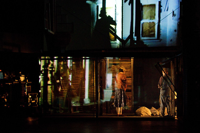
http://farm8.staticflickr.com/7277/7024467805_f2e1b5a288_z.jpg
It was still worthy. Even with the complication of merging stories, the production itself deserved a pet on the shoulder. The performance still had some highlights to it, and this is from someone who struggled through the entire play. Although puzzling, the visual contrast between the two brought a completely new experience to the audience. The busy transitions, including the lighting, projection and music, allowed people to dissolve into either mood quickly to my surprise (maybe that was the weird part for me, since my mood was transferred but my brain was still processing the previous information). Moreover, the idea of adding projection was fascinating. Within such a tiny stage, the projection enabled a faster and more effective transition of setting, at the same time added a modern taste to the whole production. Only if they could think about the angle of the projection, bacause from where I was sitting, the stage looked broken from the middle sometimes.
Speaking of modern taste, the addition of angled cameras was innovative. House Divided was the first theater play ever I saw that used cameras on stage, and I can be certain that it is not the last time. Since the stage was so tight, it was almost impossible for the actors to face the crowd all at once, but the camera helped them to do so. Also, since there were several scenes involved telephoning, without the cameras, it would have been two people talking to each other across the stage. However, with this technology installed, a much more realistic act became available.

http://images.nymag.com/guides/fallpreview/2012/theater120830_anticipating_560.jpg
I have to say, House Divided was a difficult play. Although the necessary details were basic for most people, without which the play could be somehow troubling to understand. However, even solely for the digital effects, the play is worthy to see, not to say the educational value of the production surpassed its challenging plots. By the end of the show, even if one were struggling like me, it won’t be hard for one to realize the impact of this performance within—just like what it felt like for people during the Great Depression and the Housing Market Crash—a feeling of concern, uncertainty and anger.
Apartheid: From the photographer’s Point of View
In our IDC class this semester, we have talked a lot about Apartheid. We even saw a play about it. But, we never had the chance to “see” what was going on. That all changed when we visited the Apartheid exhibit at the International Center of Photography (ICP). Out of all the pieces there, only two had a lasting impact on me.
The first to hit me was a photo of the aftermath of the 1976 riots in Soweto taken by Peter Magubane. It was a picture of a dead body. There were many images of the deceased, but this one affected me in a powerful way. In order to cover the dead male someone put a newspaper over him. It just shows how poor the nation was. No one had a blanket to conceal the corpse. Adding insult to injury, if you were to see what was written on the newspaper, it was an op-ed article talking about how long Blacks would fight for freedom in South Africa with the news caption as, “What would you die for?” I don’t know if Mr. Magubane planned on using this irony or if it was just a coincidence.
The second piece wasn’t a photograph. It was a sculpture by Hans Haacke. It was used to criticize Alcan, an aluminum company that still had mines in South Africa. During Apartheid, many companies and corporations pulled their operations out of South Africa in fear of public backlash. Alcan remained and according to Professor Bernstein, they said they promoted the arts in South Africa. So, Mr. Haacke used that idea to make an aluminum piece with the Alcan name on top. It composed of three parts. The outer edges have pictures of opera and a play. The middle shows the dead body of Stephen Biko, an activist. By juxtaposing the three segments, Haacke successfully ridicules Alcan’s dealings with South Africa.
ICP was an interesting experience. It really showed me how photojournalism was different back then. There was no Twitter or Facebook. These brave photographers needed to go to magazines to get their pictures published so that the whole world would know what is going on in their country. These men and women deserve credit because they helped exposed the problem that was going on in their country and this exhibit is a way of appreciating the work they have done.
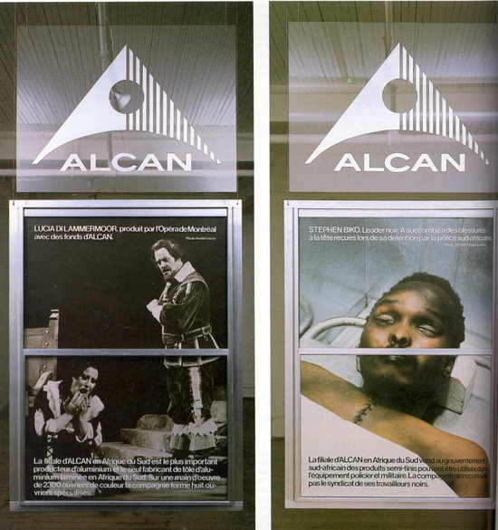
Hans Haacke creation